How to Reduce Your Website’s Cognitive Load
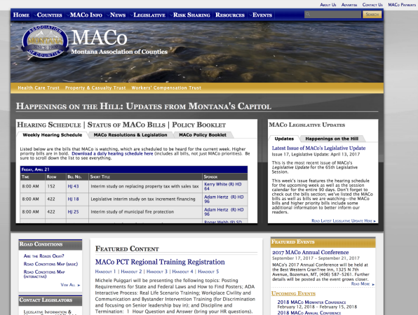
What happens when you see a website like this?

If you’re like most people:
- Your eyes jump all over the page, unable to land anywhere for more than a second or two
- You can’t slow down and read something because your eyes are being pulled to another part of the page
- You keep catching glimpses of multiple navigation options and links
- You can “see” text but find it tricky to read (e.g., can you find the “Health Care Trust” link?)
In other words: This is website has a high cognitive load.
What is cognitive load?
“Cognitive load” is the mental energy a task requires—and it’s a word we use often at Mighty Citizen because we see it all the time.
A website with a high cognitive load feels like work. You have to concentrate to perform the task you’re on the site to perform. When you eventually complete your task—if you complete your task—you might actually feel exhausted.
When cognitive load is high:
- Your users get frustrated and annoyed
- Your abandonment and bounce rates go up (i.e, the number of users who leave your site insantly, without doing what you want them to do)
- Errors are more likely
- Your user’s brain shuts down and becomes less open to surprises as it starts seeking the familiar (which also causes them to read less)
How to minimize cognitive load:
1. One Action Per Webpage
Other options can be available, but it should be ultraclear which are primary and which are secondary.
2. Make that Action Easy to Complete
A button click, a simplified form, a highlighted link—whatever you want your user to do, make it obvious.
3. Use Structure on Your Page
This means using headlines, sub-headlines, bullet points, numbered lists, etc. Break up the giant blocks of uninterrupted text.
Thoughts on web development delivered to your inbox
4. Build on Existing Web Standards
In other words, take your cues from great websites. (And hiring a great Web design team doesn’t hurt.)
5. Use Visuals that Support the Purpose of the Page
If you’re going to use photography, illustration, or iconography, make sure they are related to the page’s goal in some way.
6. Less Text!
When you draft content for a webpage (or any digital outlet, really), you should then attempt to cut 30-50% of the words during your edit.
7. Test With Your Users
There are several simple ways to perform your own testing.
The Bottom Line
You have precious few moments with most of your users online. In those few moments, you have to make the experience equal parts easy and surprising. But at a minimum, you don’t want to confuse your users. A vast majority of the Internet still suffers from high cognitive load design. Don’t be part of the problem!


