
Correcting the Top Myths About User Behavior
In the initial phases of projects, we talk with our clients about what they want their sites to achieve. In this discovery phase, we tend to answer many of the same questions and correct a lot of pervasive ideas about how people use websites. We thought we would take some time to address several common myths and help you better understand user behavior on your website.
Myth 1: People Don’t Scroll
There is often a concern among clients that users won’t scroll. Often, it gets asked of us as “users don’t scroll do they?” In reality, the question needs a little refinement. Essentially, it comes down to this: Users will scroll if they are interested in finding out what is lower down on the page and if it is clear that there is more content down the page.
For an organization, you should be asking yourself these questions:
- Am I boring my users at the top of the page? If so, they won’t scroll down.
- Am I giving my users hope that something below the page might be relevant to them? If so, they will scroll to see it.
- Is the design of my site making it clear that there is more content down the page?
Blanket questions along the lines of, “do generic users scroll on generic pages” are, in the end, unanswerable. Users will scroll on your site if you give them a reason to scroll. So, our advice is to think of the top of your home page as a way of setting expectations for interest and relevance.
Furthermore, as improved page load times have allowed for larger images and mobile has had its own effect on shaping users behaviors, scrolling likelihood has only increased.
Here’s what we tell our clients:
Ask yourself: What can I do to make my users want to scroll?
Related research on scrolling behavior
Myth 2: All Important Content Must Be Above the Fold
Closely related to the scrolling issue is the issue of “the fold.” If you are worried about people not scrolling, it seems natural that you would make sure that all of your most important content is up high on the page, where users are likely to see it first. However, if you think about this a little, problems become obvious right away.
First of all, people do scroll as we saw in the myth above. Secondly, if you cram lots of content up at the top of the page, it makes it harder for someone to find something relevant. There are too many distractions and too little hierarchy to focus a user’s attention. This makes them less likely to want to scroll. Determining relevance becomes too much work. Third, “the fold” comes from a newspaper metaphor. People do not read websites as they read a newspaper. They are typically more “task-oriented” on the Web and inclined to skim for keywords that will help them accomplish what they are at the site to do. Finally, it has become very clear that users are increasingly looking at websites on their mobile devices. Here, “the fold” for the same page is very different depending on what device you happen to be holding at the time.
Here’s what we tell our clients
Think page hierarchy, not “fold.” Be very clear what job a particular page is doing and make sure that users can see a logical order that they can understand. This will make your page more effective and set you up for mobile consumption.
Related research on “the fold”
Thoughts on strategy delivered to your inbox
Myth 3: Pages should be accessible in three clicks
The idea that all content should be accessible within three clicks has been floating around the user experience world for at least as long as there has been a user experience world. On the surface, it seems reasonable. It sounds like a measure for how easy content is to find. Maybe back in the early days of the Web, it made a little more sense. Especially since UX teams tend to put more focus on the high level pages, leaving pages further down in the site somewhat ignored.
However, this is not really how people look for information on the Web. A better way of thinking about it is “information scent.” Like an animal hunting for food that follows a trail based on a “scent,” a user moves through a website looking for relevant information. Users are willing to continue clicking towards their target if they feel like they are getting closer to what they are looking for. Once the scent is lost, the user feels the urge to leave the site, to search, or to start over at the home page. Any of these responses is a sign of frustration and a loss of confidence in your site.
Using this metaphor, thinking like your users do becomes a whole lot easier. Users don’t count the clicks it takes to find the information they are looking for, but they are fanatical about seeking relevance.
Here’s what we tell our clients
Think about the whole of your content as a system. Developing a site map of your content can go a long way towards making sure you are presenting well-labeled links that narrow a user toward lower level pages.
Additional Research on the “three click” rule
- http://www.uxbooth.com/articles/stop-counting-clicks/
- http://marketingland.com/user-experience-myth-truth-three-click-tap-rule-104760
- http://uxmyths.com/post/654026581/myth-all-pages-should-be-accessible-in-3-clicks
- http://en.wikipedia.org/wiki/Information_foraging
Myth 4: People Read on the Web
We like to think that users read the text on our sites as they would read a very special book. They should take a careful review of the information given, weigh a few options before making a carefully considered click.
The reality is more complex. On most sites, users skim for keywords or relevance when they first arrive at your site, however, once they see relevance and a path to accomplishing what they are there to do, they will read until that relevance is lost.
If you are familiar with Daniel Kahneman’s book Thinking Fast and Slow, you might think of your users as being in System 1 (automatic, subconscious thinking that resembles habit) when they arrive and System 2 (slower, conscious thought that requires effort) once they see something relevant. Your site’s job is to move your user from the first state to the second one.
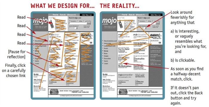
One of the great books to come out of the UX field is Steve Krug’s Don’t Make Me Think. When I see websites that are loaded with pages and pages of text that have few headers, images or places where the text gets broken up, I think about this image from that book:
Here’s what we tell our clients
People skim for relevance on the Web before they will read. Think of your site as “buying” their attention in 5 second chunks. If they see something relevant, they will stay another 5 seconds.
Additional Research on how people read on the Web
- https://www.nngroup.com/articles/how-users-read-on-the-web/
- http://uxmyths.com/post/647473628/myth-people-read-on-the-web
Reading over each of these myths, it becomes pretty clear that they are inter-related. Taken together, they should create a clearer view of how users interact with information on the Web. People come to your site to achieve certain tasks or to learn something new. They will stay if your site continues to make them believe they can do that. The best way to be sure you are presenting relevant content to your users is to talk with them, but a good first step is to have the right model in your mind and in your organization about user behavior.
