Association Web Design has a Membership Problem. Here’s How to Solve it.
When we approach an association web design project, one of the first questions we ask is:
The first inclination is to say, “Both!” This is obviously the right answer. However, when it comes to association web design decisions—like how you lay out your home page—you usually have to decide to favor one over the other, even if only slightly. One is your primary goal, the other is your secondary goal.
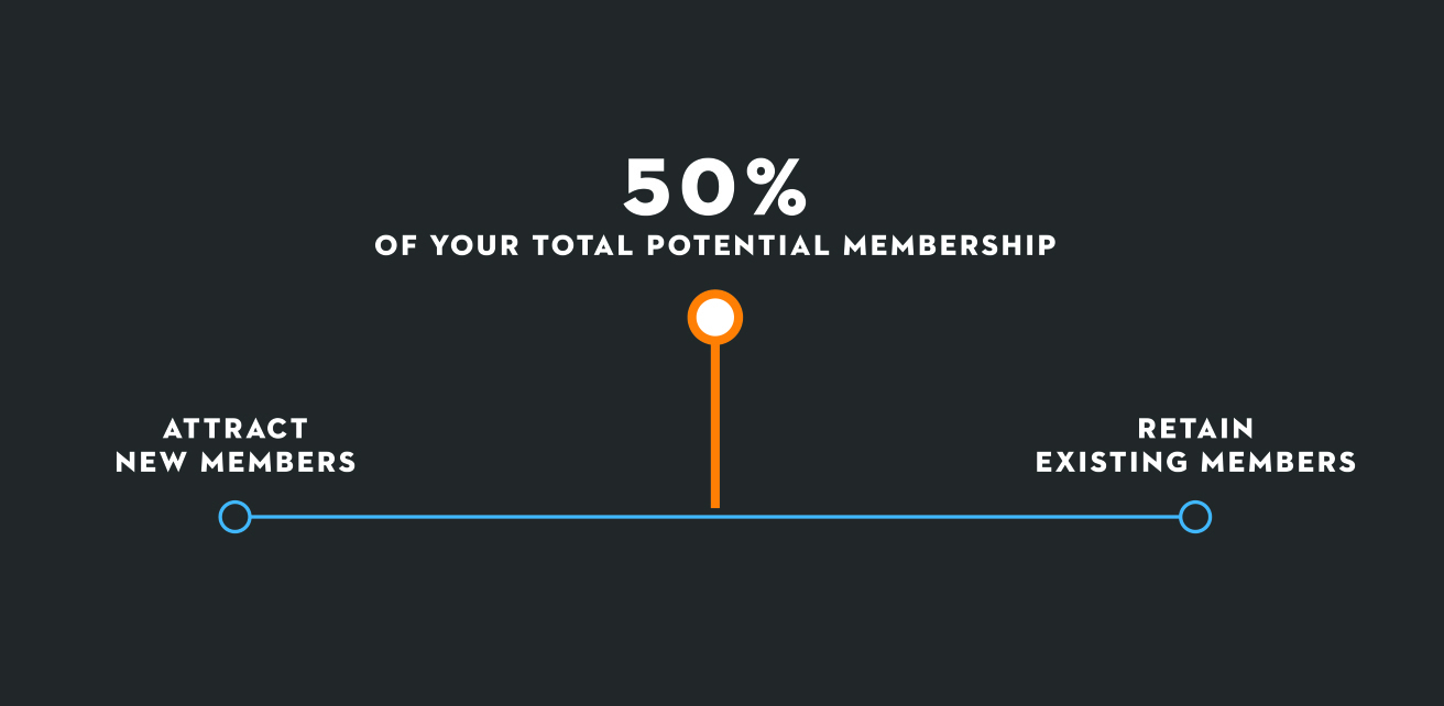
Are more than 50% of your total potential members signed on with your association? Plot yourself on this continuum:

If a high percentage of your total potential members are already on board, you fall far to the right end and should therefore devote most of your homepage to making sure those existing members are happy and seeing the value in what you provide.
But if very few of your total potential members are signed up, your homepage should (primarily) make your case for joining.
Association web design ideas when you need more members
- Place the membership form where it’s quick and easy to find
- Share your (well written and concise) mission statement—i.e., why you exist
- Make the case for why someone should join your association
- Link to more detailed “Why Join?” pages
- Establish your credibility by using member testimonials, years of service, awards, etc.
- Concisely list the benefits of membership
You want your homepage design to instantly convey this simple message: You should join.
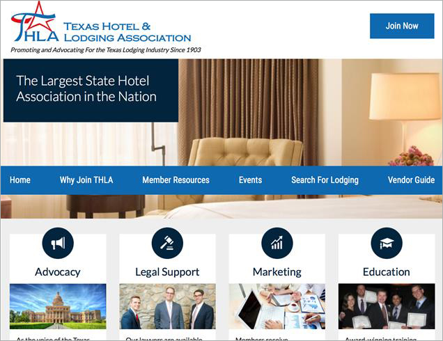
Consider the homepage of the Texas Hotel and Lodging Association:

There are four strong reasons to join front and center. There are high level statements (“Largest State Hotel Association in the Nation,” and “…Since 1903”) that prove they have a record of success. And the ‘Join Now’ button is easy to find, colorful, and where you would expect it to be (on desktop and mobile).
Thoughts on web development delivered to your inbox
Association web design ideas when you need to retain current members
On the right end of the continuum, when you need to keep your membership churn low and demonstrate your value, you should create a homepage that displays features like:
- Educational opportunities with easy sign-up
- Helpful reports and publications
- High-level lobbying successes (e.g., “We killed this bad bill, we passed this good bill…”)
- Upcoming events with easy sign-up (and fun photos from previous events)
- Services and benefits that members may not be aware of
- Quick links to member services pages (which might do the work of a “Why Join?” page)
The quick and obvious takeaway your homepage should offer: We are working to make you successful.
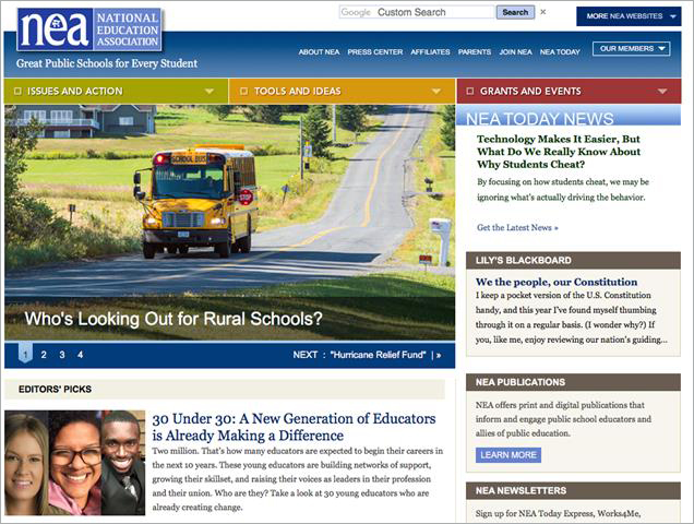
Look at the home page for the National Education Association:

This looks like an association that has a high percentage of their members on board. They are using their homepage to make sure those members continue to see value. They choose to display issues of current concern to members, publications, member profiles and other links that are of more value to those who are current members. These links very well could help convert new users also, but new users appear to be a secondary audience.
Don’t ignore balance
Remember, we’re talking about balancing both new members and existing members. While it is unlikely that you should divide your resources exactly 50/50, you should never ignore the secondary audience.
What if you aren’t sure?
Some of you might be saying to yourself: “I am not sure where I fall on the continuum.” Without knowing, you are making crucial decisions blindly.
First, try to understand approximately what percentage of your total addressable market (your “TAM”) you have on board today. TAM is determined in a variety of ways and can vary depending on your industry or population. But settle on a number and then find your place on the continuum, which will, in turn, influence how you design your new website.
Whether you’re working to attract new members or retain existing members, your association website is critical to your success.


