Must-Haves for an Interactive Annual Report
Donors don’t ask for much in exchange for their money. (In fact, most donors don’t ask for anything.) But every donor—especially the major ones—wants to understand the impact of their gift(s).
Which is where the annual report comes in.
For decades, nonprofits have been churning these out—assembling stats, listing Board Members, printing their PNL report, etc. Organizations often fill in the gaps between stats with content meant to inspire.
And while annual reports have come a long way since their early days, they remain primarily printed documents. But with the ubiquity of digital technology, it’s about time annual reports made the leap to online, and more importantly, interactive experiences.
The Advantages of Interactive Annual Reports
- Interactive annual reports are more interesting than printed reports—meaning more people will engage.
- They have a longer shelf life because they live online (instead of the recycling bin).
- The report lands more effectively because the user is helping shape the experience of “reading” it.
- It can be reused each year (once you have the framework).
- It can more easily include a call to action—e.g., donate.
- It can be updated over time, if needed.
The Challenges of Interactive Annual Reports
- An interactive annual report may require a larger investment of time and money, depending on your typical printing costs.
- It requires more time to build.
By the way, of course you can have two versions of the same report—both printed and digital. If your donors and supporters trend older, having a printed version is especially important.
What Should Go Into an Interactive Annual Report?
There isn’t a single answer.
Take Advantage of Interactivity
Let’s be clear: An interactive annual report is meant to be interactive. Simply uploading your annual report onto your website—usually in PDF or HTML form—misses out on what digital technology can do for your users.
Examples of Interactive Elements
There are countless ways to bring your organization’s past year to life via an interactive experience. (That’s the power of digital technology!) But some low-hanging fruits that won’t require a major deployment of money or resources include:
Animation
And by “animation” we don’t mean “cartoons” or those “explainer videos” that are everywhere. We simply mean making different content elements move on the page.
Animation does two things a printed report never could:
- Show the relationship between different pieces of content
- Adds a level of visual interest that static images can’t
Looking for examples? Here’s a site we’ve built that features animation:
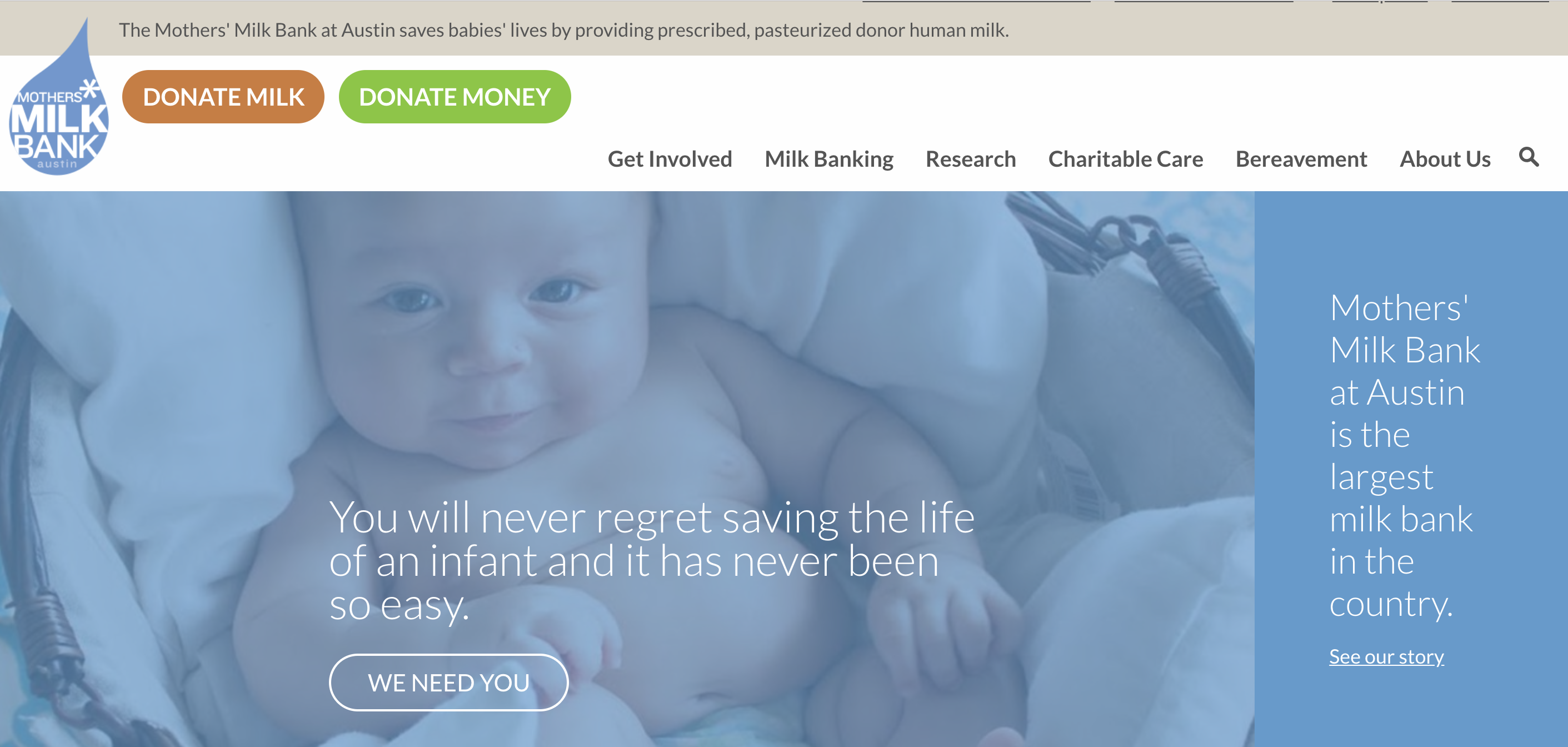
Mothers’ Milk Bank: Homepage

The animation on the Mothers’ Milk Bank homepage is subtle but unmissable.
When the page first loads, three pieces of content appear, one after the other: the hero message, the call-to-action button, and the positioning statement (on the right-hand side). Then, when the user scrolls downward, more content “appears.”
The effect of this animation on the user is subliminal. It feels like a story unfolding (and stories are the most effective means of persuading). It also keeps the user’s eyes moving around the (simple) page, drawing attention to important content.
Ed-Fi: Getting Started
Ed-Fi is a not-for-profit organization that aims to get educational data systems to speak the same “language” so teachers can have a full view of each student’s performance. It’s a daunting, potentially confusing topic for Ed-Fi’s audiences—highly technical, complex, bold.
So Ed-Fi used animation to help invigorate their call-to-action:

As users scroll down the Getting Started page, each of the four steps come to life—making a possibly confusing process seem simpler and more attractive.
Personalization
For a couple of years now, Spotify has been at the vanguard of personalized online experiences. The music streaming service compiles individualized playlists (every day, a new one) for its users. It sends emails about upcoming concerts of bands it knows that you like. And it constantly updates its mobile app in response to usage patterns.
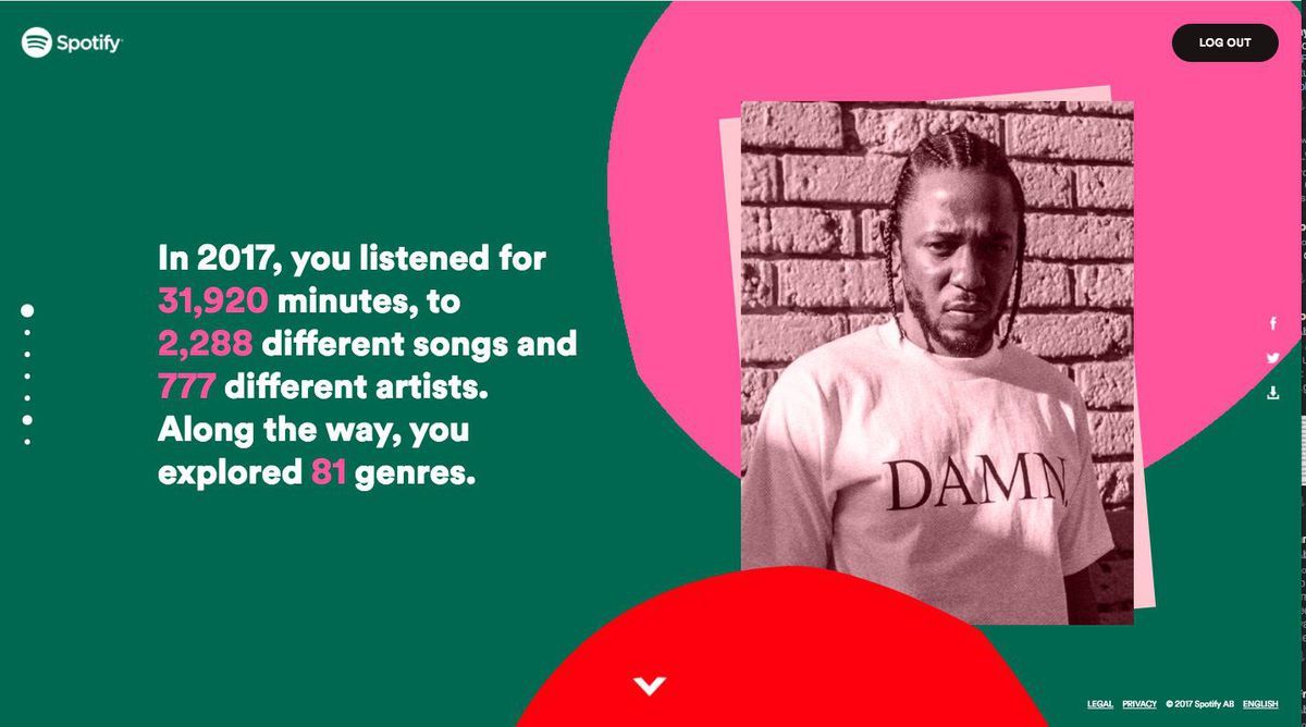
But Spotify’s biggest differentiator is its “Year In Review” experience.

Here’s how it works:
- In December, you get an email with a link to your personalized “Year in Review.”
- You click the link and are taken to the Spotify website, where…
- You see everything you ever wanted to know about your musical taste.
- The experience involves all of your data—the songs you listened to, the artists you followed most, the amount of time you spent listening, the genres you prefer, etc.
- Along the way, the content matches you. If you listened to Kendrick Lamar’s music more than any other artist, you’ll see his picture.
The result is an eye-opening, revelatory, sometimes embarrassing experience. (Do I really listen to that much Erasure???)
But despite it being an automated, algorithmic experience, it feels so you. And an interactive annual report—if it’s fueled, in part, by your donor CRM and some savvy database work—can have the same impact.
Quizzes and Forms
By asking your users to answer questions in your annual report, you force them to become more personally invested. And by asking them to type in information, you turn your one-way communication into two-way—using the interactive annual report as a compelling excuse to collect input from your users.
How might you use a quiz?
You could start your annual report with a question:
Which of the following four programs have we launched this year?
- Food Bank
- Young Donors Society
- Early-Childhood Education Program
- Financial Literacy Classes
Your users make their selections and are told, on the next page after they submit their responses, whether they’re correct or not. It’s a simple interaction that can easily be built by an experienced web developer. And voila! You now have a good excuse to tell the story of your new programs.
And what about forms?
Maybe halfway through the interactive annual report, you ask another question:
What’s the most important thing we do for the community?
… followed by an open-ended form field where users can enter their response. And again, voila, you have a whole host of readymade testimonials ready to share—or, at the very least, you have some helpful user research that can help you shape your internal processes and operations. As we say around Mighty Citizen all the time: Research kills opinions.
Thoughts on strategy delivered to your inbox.
It Must Be Mobile
Anything you put on the Internet should be mobile-friendly and mobile-responsive. This doesn’t mean simply squishing a desktop site into a smaller size. Instead, the mobile version of your website (and interactive annual report) must be designed on its own.
For an interactive annual report to reach the largest possible audience, the mobile version should be just as engaging as the desktop. But it doesn’t need to be identical. For example, “hovering” your cursor on a desktop website can trigger interactions (e.g., drop-down menus open). But hovering isn’t possible on a smartphone; only clicks. So each part of your new annual report should be thoughtfully weighed against a mobile user and desktop user’s ability to interact with it.
Jump into your Google Analytics: Which percentage of your website users are visiting on a mobile device? If your interactive annual report isn’t optimized for the mobile experience, that percentage of people won’t be able to engage with it. Missed opportunities!
Simplified and Expanded Content
In some spots, you should try to pare down your content. In other spots, you should use interactivity to expand on ideas.
The quickest way to simplify your content is to avoid giant blocks of text.
People read differently online than they do on paper. On paper, people tend to read every word, left to right. But online, they read in an F-Pattern: scanning down the left-hand side of the page, occasionally letting their eyes drift rightward. In other words, people don’t read everything you write. The less text, the more likely your message is to be consumed and understood.
Then there are images—a great way to take advantage of the interactive nature of your new annual report.
For example, on the (web)page of your new interactive annual report in which you list your Board of Directors, you could easily display their headshots. When the user hovers (or clicks) on each person’s photo, the photo flips over (like a card) and displays a quote from the member, a link to their bio, etc.
In short, keep the copy simple and the images/interactions robust. Remember, we aren’t simply slapping a printed report online; we’re using the power of digital technology to bring your story to life.
Timing
If you want to pursue an interactive annual report, you’ll need to start earlier than normal. This can be tricky because, often, you don’t have some of the precise content until the fiscal year is complete. But with the right design partner, you can have the whole annual report built, then drop in the right content just before you launch it.
Do not wait too long. Building an inaugural interactive annual report will likely take 3-4 months. This time will be spent building the user flow, architecting the pages, designing them (i.e., adding a visual identity), integrating content, launching, and promoting.
So if your annual report needs to be released at the end of February, you’ll want to begin your design in November (especially with the busy holiday season).
How to Get Started
If you have staff who can bring the interactive annual report to life, go for it. But note: It’s going to take longer than you’d think. And if they have other daily tasks to complete, you’ll need to start even earlier.
The more efficient solution is to hire a design agency that can bring your vision to life quickly and effectively. You’ll be in control of what and how your annual report becomes; they’ll lend you the technical and design expertise to make it shine, on budget and on time.
If we can help, drop us a line.
And whatever you decide to do with your annual report in the coming years, remember that it can be a chore or a delight, an easily forgotten booklet or an evergreen marketing spark. Best of luck. And please, keep up the great, important work you’re doing.

