
In 2019, the International Office at The University of Texas at Austin rebranded itself and became Texas Global. This was more than a new name; it was a new brand that reflected an expanded purpose. Texas Global would become the university’s liaison to the rest of the planet.
Texas Global hired Mighty Citizen to completely reimagine their website. They asked for a design and experience that would tell their growing story, elegantly handle tons of content, and let people from around the world perform critical tasks.

Different Content for Different People
Among a diverse set of stakeholders—which also includes industry partners, other universities, foundations, and non-governmental organizations—Texas Global serves three primary audiences:
- UT Austin students who want to study abroad
- International students and scholars who want to study or conduct research at UT Austin
- Faculty engaged in research and teaching abroad
Each group has unique needs from Texas Global. For example, UT students who want to study abroad need to quickly see what’s involved—how to sign up, which countries are available, what the experience will look like, etc. Meanwhile, international students curious about coming to Austin for college need reasons to come, a detailed explanation of the process, and expert advice on how to get a student visa.

In a few spots on the homepage, users quickly self-identify so they can then be ushered toward content most relevant to them. This happens in the main menu, but more beautifully in the above homepage module. Here, users pick which audience they fall into, choose what they want to do or learn, and click “Go” to be taken there.

Bigger, Faster, Stronger, Better
International students—whose academic contributions to the University grow more substantial every year—should land on the Texas Global website and immediately understand that UT Austin is a modern, thoughtful, and impressive school. A spark should ignite: “This is somewhere I could thrive.”
Throughout the design and development process, we kept asking ourselves how to amp up the site’s pizzaz (without sacrificing usability, of course). We came up with a few flourishes that are as beautiful as they are helpful.
First, there is the interactive globe:
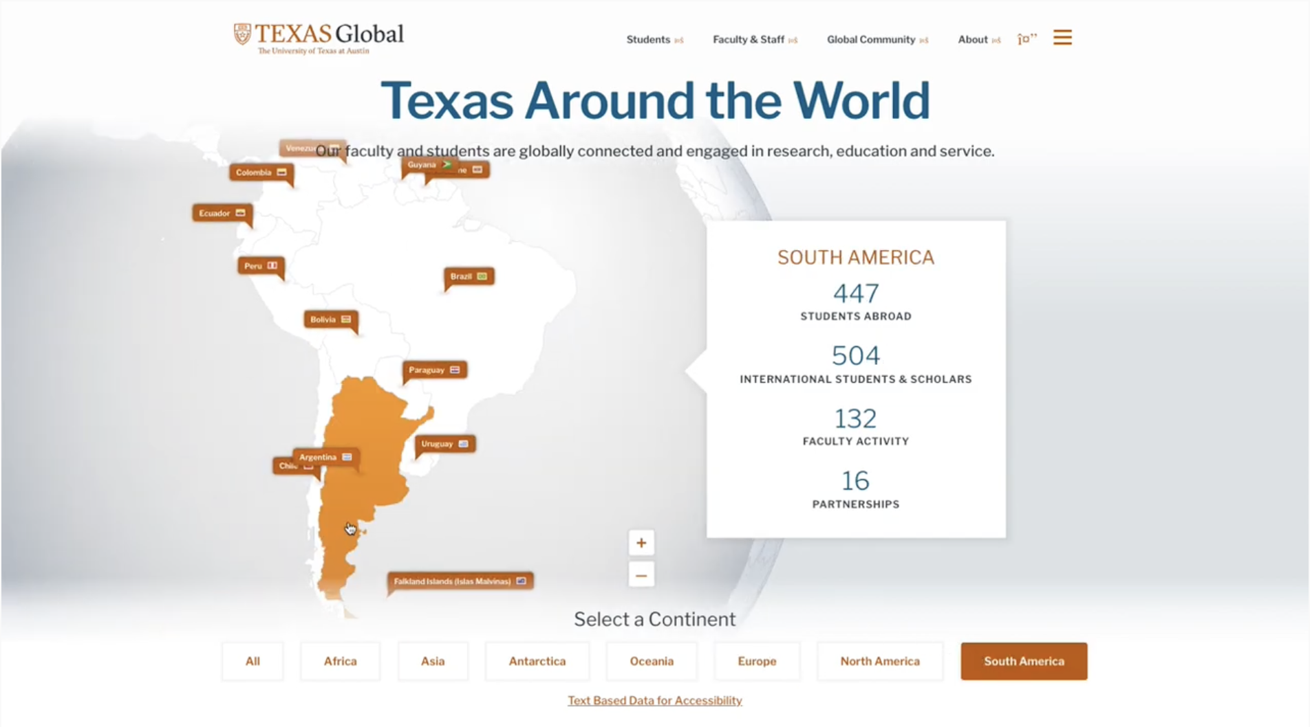
The globe spins on its own. But once you grab it with your cursor, you can rotate it to your desired location. Each orange dot represents a place on the Earth where either (a) UT Austin students are studying, (b) UT Austin faculty are teaching and/or conducting research, or (c) Texas Global has institutional partnerships.
When you click an orange marker, the country is highlighted, and new data about that country appears on the right:

When a user picks a country from the globe, clicking on the country name opens a new page filled with dynamic, ever-changing content from that location—including news stories, student stories, and research efforts.
For example, in Colombia, we can read about a Colombian lawyer, Eliana Caceres, who left behind her successful legal career to move to Austin to study at the Texas Global English Language Center and pursue a second law degree in the U.S. We also can check out ongoing research from UT faculty—including Donna De Cesare, a journalism professor, who’s documenting the spread of U.S. gangs in Central America through photography and documentary. Or Anthony Di Fiore, Chair of the Anthropology Department, who’s studying primates in the Amazon to understand how ecology shapes their behavior.

In short, the digital globe is fancy and fun—a bit of web design and development genius that makes it clear just how dynamic and substantial Texas Global is. But don’t take our word for it; try it out for yourself.
News and Events

Did we mention that Texas Global is a content-producing machine? They are. They write press releases, student and faculty profiles, straightforward news stories, and research overviews. So how can all this content be displayed so that visitors want to consume it? In this case, the beauty is in the details.
Throughout the site, subtle animations and custom photography offer a sophisticated, thoughtful, and modern feeling. And they increase the chances that someone will stumble upon something they weren’t looking for—something that excites and inspires them.
Events, meanwhile, are a whole other kettle of fish. Texas Global hosts and sponsors an event every couple of days on a variety of topics—including education abroad fairs, Q&As for students and faculty, program-specific overviews, country-specific explorations, and many more. To make events easy to peruse and digest, we built a system with simple filtering, sorting, and searching. No matter what a visitor is curious about, within a few clicks they can find an upcoming event that applies.

Individually, none of these design elements are game-changing; but taken together in a single user’s experience on the website, they reinforce in visitors’ minds the notion that Texas Global specifically (and UT Austin generally) are thoughtful in their work. They take their global efforts seriously.
Designing the Study Abroad Experience
We design for human beings.
That’s a cute, pithy sentence you’d expect a marketing and design agency (like Mighty Citizen) to say. But for us, “designing for human beings” is a simple way of expressing a complex endeavor. Because human beings are irrational and emotional. They contain multitudes. We must structure and design a limited number of experiences for a virtually limitless number of people.
So “designing for human beings” means bringing together research, psychology, visual design, information architecture, writing, and a bit of good luck in order to delight and satisfy (almost) everyone who comes to the website. Easy, right?
For example, one of Texas Global’s key audiences is UT students who (may) want to study abroad. These students know they (may) want to go to another country, but they don’t know much else. Here’s how we designed the site to capture their attention and convert it into interest and action.
- We put “Students” as the first item in the main menu. Within that drop-down menu, the first option is “Explore Abroad.”
- When students go to “Explore Abroad” they see two things: big, bright photographs of other students enjoying their time in another country and a list of the many different ways they can go abroad.
- When they select the first option, “Education Abroad,” they are presented with three options that answer their most common questions: Get Started, Find a Program, and Funding Resources.

So, from the homepage, a student who (may) want to study abroad is only two clicks away from learning precisely where they can go, how to get there, and how to pay for it. As usual in website design, simplicity and clarity wins the day—while sprinkling the path with brief moments of visual and interactive delight.
The Future is Bright
All of these architectural and aesthetic elements would be pointless if the staff of Texas Global couldn’t easily manage their site. So, as always, we built the site on a very user-friendly content management system—in this case, a custom build of Drupal. Adding news stories, editing the spinning globe data, announcing new grant applications, etc.—it’s all a breeze now.

As Texas Global continues to expand its services and influence—as they have done with passport services, international leadership development, hosting delegates from abroad, etc.—their website is ready to quickly and elegantly reflect their evolving brand.
We’d be remiss if we didn’t mention how valuable the Texas Global team was to our shared success. It was a true pleasure to (digitally) bring UT Austin to the rest of the world.