Annually, millions of people around the world live with the lasting impact of war, crisis, and conflict. It’s in this atmosphere that Humanity & Inclusion’s work begins.
Humanity & Inclusion (HI) has completely changed the trajectory and quality of life for those left with injury, isolation, and trauma after conflict, often while they still face violence and exposure to deadly weapons. HI is an international not-for-profit organization acting “on the front lines of the world’s most pressing emergencies to promote disability rights, provide rehabilitation, and ensure people live safely after conflict.” Their work in providing life-changing prosthetics to people who have lost limbs in conflict along with their work helping to remove millions of unexploded land mines fueled their advocacy work to ban anti-personnel landmines. This work, which included the co-founding of the International Campaign to Ban Landmines, resulted in their being co-recipients of the 1997 Nobel Peace Prize.
And yet, Humanity & Inclusion is barely known in the U.S.—e.g., a mere 6% of Americans recognize their brand, compared to 65% in France where the organization is headquartered.
Stretching Every Dollar
In 2019, we celebrated 20 years of Mighty Citizen. In celebration, we set up the Mighty Big Grant—a $25,000 package of free marketing and design services. Because their work is so impactful, we were honored to name Humanity & Inclusion as our grant recipient. For them, it was an opportunity to both expand awareness and set the foundation for HI’s American fundraising. For us? It was a challenging opportunity to get creative with one mighty nonprofit.
The budget for this project required that we be very efficient in our approach while still developing knock-out campaign work. Our team was set on answering one question: How could we simultaneously expand HI’s brand awareness in the U.S. and establish a foundation for future fundraising efforts in America? That’s no small task.
The Strategy: You’re Not Ready to Fundraise (Yet)
Most of the money raised by Humanity & Inclusion in the U.S. came in during emergencies—and notably, from new donors. Haiti. Nepal. Bierut. This kind of fundraising is painful; it’s hard to build a sustainable nonprofit when you’re dependent on the next disaster.
A profound shift was needed. We wanted people to be connected to HI because of the good they do year-round. How could we inspire people to give when there was no active disaster or conflict? How could HI’s messages show up out of the blue and make people care enough to give? If only 6% of Americans were aware of Humanity & Inclusion and their work, how could we elicit the attention of the other 94%?
What HI needed most was a nuanced understanding of the American audience they weren’t reaching. Who were their best potential audiences and which messages would resonate with them? We needed to conduct some good old-fashioned user research.
With a limited budget, we decided to conduct user research online through social media, not in a focus group. We would develop several campaign messages, push them out to different audiences, and then carefully measure how they performed. This would tell us which of HI’s messages resonated most with which U.S. audience.
For HI, we weren’t simply crafting messages and bringing them to life with provocative visuals; we were creating a North Star for current awareness efforts and the foundation for future fundraising.
The Creative: Disrupting the Scroll
Social media platforms would allow us to evaluate different campaign concepts efficiently. We’d identify different affinity groups to target via Facebook and Instagram. Previous experience told us these groups were inclined to support HI’s work—like combat veterans or those active in disability rights. Altogether, we identified five different audiences that would receive the campaign, in an effort to disrupt their social media scroll and incite action.
With our segmented audiences in place, we developed the messaging and creative for three different ad campaigns. Knowing that HI has always been willing to pursue provocative, highly-conceptual messages in an attempt to break through the malaise of the average consumer, we tested a range of concepts: one emotional, one rational, and one highly provocative.
We then served our three ad campaigns to all five of our audiences to gauge which messages and creative would resonate with each audience. This allowed us plenty of opportunity to ramp up what was working and drop what wasn’t, all while providing useful user research.
Let’s take a look at each of the campaigns.
Campaign #1: Casualties of War
The scars of civil unrest—psychological trauma, physical harm, economic upheaval, forced displacement—are lifelong conditions that torment and disable the innocent. War doesn’t end when the last bomb is dropped; the scars and trauma and injuries last for years, sometimes generations. Around the world, millions of people are “casualties” of war that ended long ago. War shapes how you view the world for the rest of your life. HI helps survivors, and this messaging highlights those deeply affected by conflict and how they persevere with the help of Humanity & Inclusion.

It’s hard to paint the picture of war to Americans who have never experienced armed conflict on their own land. This campaign needed to make the fallout of strife a palpable human condition that thousands endure, even while Americans scroll through Facebook. This is why Xiemna’s story (among others) is so powerful. She was putting her son to bed when disaster struck. Millions of Americans put their children to bed every night. In this way, they can relate to Xiemna. The call to action asks the viewer to learn more about the stories of these “casualties of war” on a landing page that highlights how HI has served them. The landing pages also feature email signups and petitions to drive conversions and future conversations.

Campaign #2: Common Senses
In the U.S., war and disaster have become abstract concepts in a desensitizing news cycle. Cause, effect, and fallout have been lost in a deluge of headlines clamoring for clicks. In America, our most immediate and obvious concerns—the pandemic, a shaky economy, political polarization, etc.—drain us of the compassion we might otherwise have for victims of foreign wars. How do we shake people out of this stupor? How do we wake up a society that has gone numb and bring everyone back to their senses?

The “common senses” campaign uses common, sensory sayings to pique curiosity, then delivers a visceral picture of reality, full of facts and truths. The copy takes on characteristics of the problem (like shattered, vanishing, or cluttered text). The message is thought-provoking, unexpected, bold, and disruptive. This campaign links to a landing page that outlines and explains surprising facts intended to leave users grateful for their heightened understanding of conflict and those affected by it.
Campaign #3: Wardrobe
This concept is provocative. It exists to stop the continuous scroll. It exploits the ecommerce model of social media—where flash sales and hot deals become just more content in our highly-tailored algorithms.

The pants, shirts, and shoes pictured illustrate dismemberment (i.e. pants with one pant leg, shirts with one arm sleeve, a single shoe). Along with the imagery, the copy subverts the comfort of digital commerce with disturbing reinterpretations of consumer language (i.e.“Half Off!”, “Blow-out Sale!”, “Flash Sale!”, “Only 1 Left.”). A clear disclaimer functions as a balm, addressing the shock of the ad and providing a CTA to halt this frightening reality.

One viewer commented on this campaign on Instagram:
“I like this post. I’ve been online window shopping so much lately. Going to this site and seeing the way they presented important information in the same format as those fast fashion sites really messed with my brain and woke me up a little. Thanks.”
The design work is uncomfortable. So much so that we tested this concept with informal focus groups before posting publicly. If we put it out there, HI had to stand with it—and we both had the resolve to do so.
The Results: Wardrobe and Women
The thing about brand awareness campaigns is you have to wait.
And wait.
…and wait.
The data has to build over time, and the more you change and tweak, the weaker your data will be. After all, it’s an experiment running in the background collecting useful information about the behavior of real people. Even if you’re just changing a word or two of the copy, it’s best to create a new campaign entirely and test it against the old campaign.
In three months of measuring our campaigns:

We also learned how different audiences are responding to each message. For example, for the first two weeks of the campaign, the Wardrobe campaign concept—by far the boldest and most controversial of the three—drove more than 99% of all clicks and landing page views. The wardrobe campaign mainly drove clicks with an older audience during this time.
Throughout the three-month campaign duration, the Wardrobe campaign landing page was HI’s top-performing webpage across the entire website, earning more views than the organization’s homepage or its Beirut emergency page. This concept also drove an impressively low cost-per-landing page-view of $0.25.
We also learned that women created a breakout demographic in response to these campaigns. Throughout this campaign, 75% of leads and 77% of clicks came from women. The women who converted and became leads (signed a petition, signed up for emails, or made a donation) vary widely in terms of age (as do the men), creating an inverted bell curve.
The “lookalike audiences” that were built for this campaign were designed to target people who “look like” HI’s donor list in terms of demographics and online behavior. Lookalike audiences typically outperform manually-built demographic audiences. That was the case for HI’s lookalikes, the audience that performed the highest across all campaigns. Lookalike audiences will be a mainstay of HI’s social advertising for campaigns to come.
Brand Awareness Leads to Fundraising
There’s a certain kind of mystique in building brand awareness—where more and more people recognize the work and can connect it to the organization. The change is incremental and the effects longlasting.
Typically, when tasked with creating brand awareness, it’s easy to forget that was the original task. We want to move on quickly to fundraising, volunteering, and more active forms of engagement. With more brand awareness in place, HI can nurture these new audiences to create future donors and supporters.
Humanity & Inclusion now has a turnkey campaign that can take many forms without adjusting the creative. It can be used across additional audiences in the U.S. or in other countries where HI is working. Together, we designed a campaign that would not only optimize their budget, but deliver key information and data that will inform their efforts for many years to come.
Landmine Petition Campaign
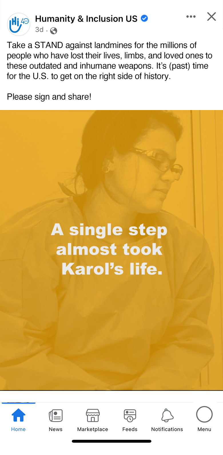
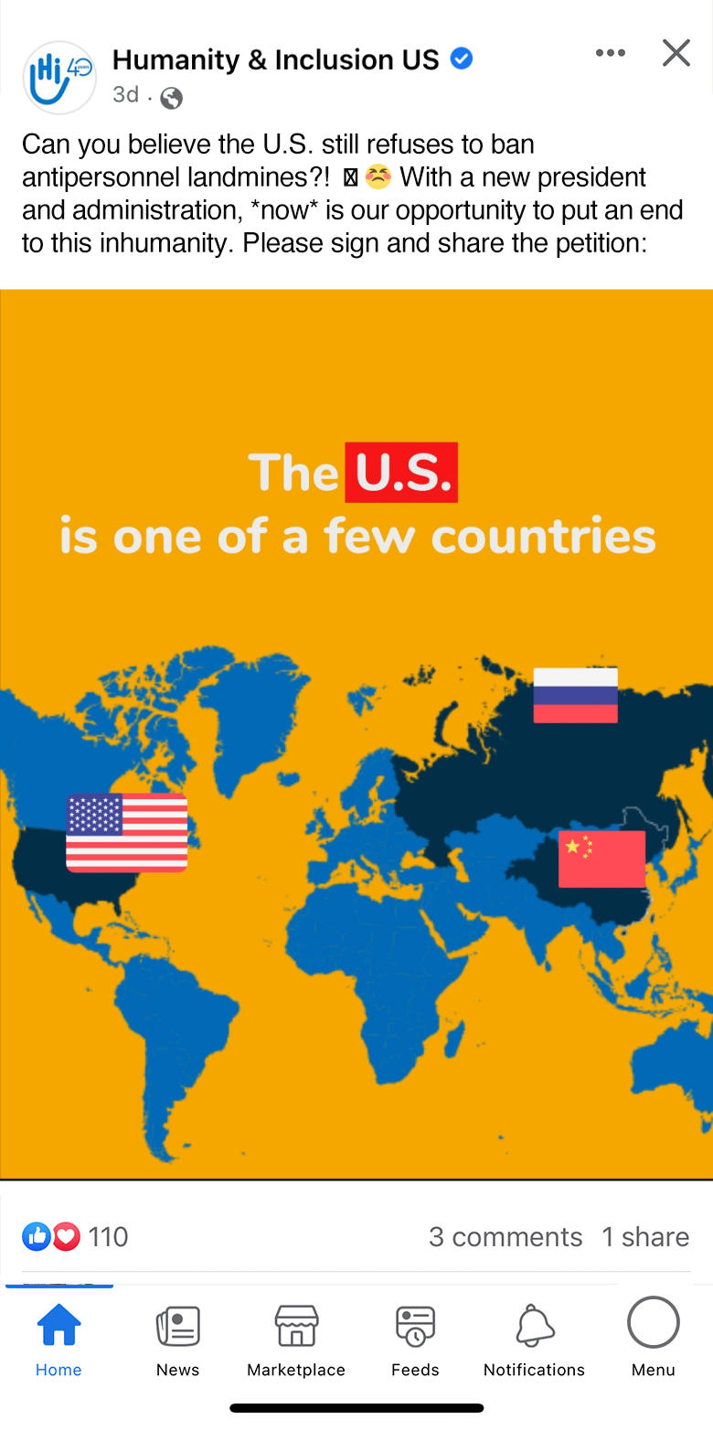
After our initial project, HI came to us to partner on a digital campaign to acquire signatures on a Landmine Petition. The United States has been on the sidelines of an international treaty to remove and prevent the use of landmines. Together, we intended to urge the Biden administration to act on the U.S. landmine policy.

Hundreds of causes ask for our time and a piece of our virtues. To create a clear and direct sense of urgency, we set out to do the same, but to distinguish ourselves. In the same vein as our previous campaigns with HI, we wanted to stop people in their tracks. And we weren’t asking just anyone—we targeted HI’s current supporters.
Building the Campaign
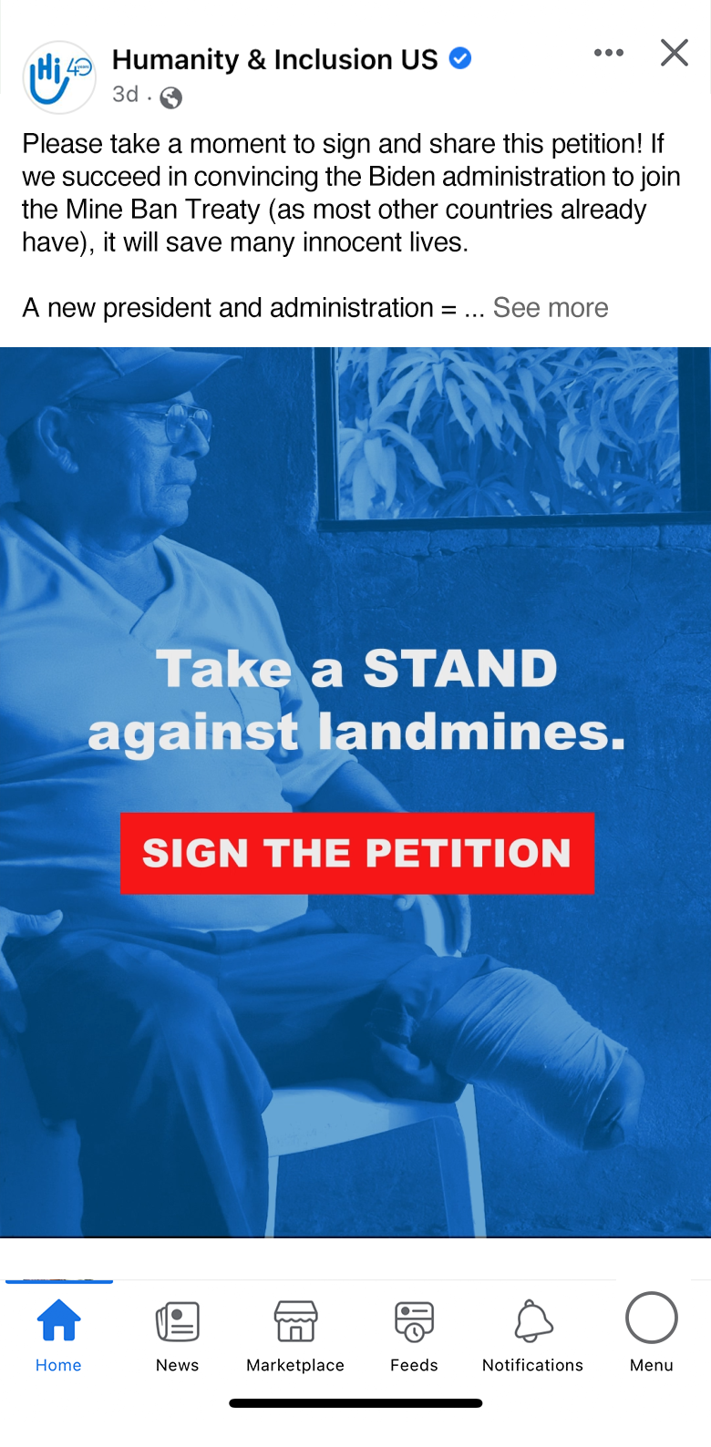
Using simple typography, a succinct message, and dramatic photography, we created an urgent, emotive feel to the petition campaign. Our campaign directly asks HI’s supporters to take action, then empowers them to do so. Embracing video and animation for this campaign, we leveraged Facebook’s dynamic creative to test various headlines and descriptions for our video and static ads with two distinct focuses: advocacy and cause.

The advocacy-focused campaign used federal imagery to promote legal action. The cause-focused campaign used photojournalistic imagery depicting landmine victims in their own environments, living their everyday lives.
The campaign copy uses strong language to provide additional context, defining a bold stance on banning the use of landmines and highlighting a sense of overdue responsibility from the U.S. The landing page briefly continues the message without interfering with the call-to-action to complete the petition.

In April of 2021 on National Landmine Day, we launched the landmine petition campaign with Humanity & Inclusion. With Facebook’s dynamic creative, all of our creative assets, descriptions, headlines, and CTAs are automatically tested in different combinations. Facebook will optimize and prioritize the “winning” combinations, ensuring that our most effective message is served to HI’s supporters.


Results
In only three weeks of running the campaign, we received 4,883 landmine petition signatures, averaging a $0.60 cost per signature. For context, the average cost per lead for nonprofits using digital advertising is $2.60 at the time of this report. In that same time, we received 17,681 clicks and 110,469 views on the campaign.
The advocacy-focused concept was the clear A/B test winner in this campaign. The advocacy ads were prioritized by the Facebook algorithm within the first day and drove 4,121 of 4,883 conversions (83%) in those first three weeks. At that point, we were able to recommend tweaks to the campaign and anticipate numbers from the full run of the budget.
Dignity for All
We’ve said it a million times: Our clients are heroes. We’re proud to work with them to further their missions and impact. Humanity & Inclusion’s work is nothing short of humbling and inspiring. As a team, we hope their work and the vulnerable communities they serve will have the attention of many more Americans. To learn more about their work, visit www.hi-us.org.
Awards
 Austin ADDY
 The Communicator Awards
 Summit International Awards


 Austin ADDY
 The Communicator Awards
 Summit International Awards