
User Experience is Just a Fancy Term for Empathy
Everyone has heard the term “user experience.” As a designer, it’s part of my job, but to folks outside the industry, it can seem confusing, buzz-wordy and expensive. But I assure you, the concept is as simple as empathy, something nonprofits have in spades. Now you won’t be able to design your own website after reading this, but you will be in a better position to understand your donors and the way they use your site.
What is User Experience?
User Experience (UX) is creating a structural flow that is intuitive for the site visitor. Have you ever gotten lost on a website or couldn’t figure out how to use an app? That’s bad UX.
Think back to a time you filled out a form on your smartphone and had to pinch and zoom because the site wasn’t mobile-friendly. How frustrating was it to fumble through the tiny forms and buttons? Did it take too long? Did you think about abandoning ship before you finished filling it out? Putting yourself in the shoes of the web visitor is the crux of user experience—would YOU get confused or flustered by your own site?
Okay, so where do I start?
It’s no surprise, more and more people are using mobile devices to access the internet each year. In 2014, we hit the tipping point where more people were accessing the internet from a mobile device than a personal computer. Google has even started pushing more mobile-friendly websites to the top in searches, even over SEO. Mobile-friendly websites aren’t optional anymore.
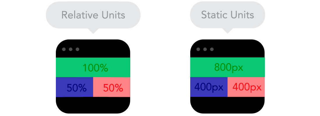
A great deal of UX starts with responsive website design and mobile-first thinking. What is a responsive website you say? Maybe you didn’t say that, maybe you’re hip to the jive, but here’s a refresher, with lovely animated GIFs courtesy of FROONT.
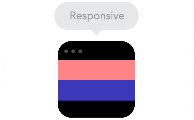
A responsive website is one that RESPONDS (get it?!) to the size of the device it’s being used on. By using relative values instead of absolute values (and a ton of other code stuff), a responsive website serves up images and assets that are proportional to your device.
You can do all the focus groups, donor segmentation and research in the world, but if your site doesn’t load beautifully on a phone, tablet, or anywhere in between, you can fuggedaboutit.
Anticipate your users’ wants and needs, and be quick about it.
Having a responsive website is only half the battle, there’s more to UX than just that. Step into your users’ shoes (don’t worry, they’re clean). Why are they visiting your site? What are they looking for, and in what order? What is the main action point—do they want to donate, learn, register? Anticipating a user’s needs might tempt you to put everything on the homepage, you know, just in case. DON’T DO IT, IT’S A TRAP!
Instead, craft a strong site hierarchy, clear navigation, and an intuitive site structure to guide your user. Did you just tell them about how great your organization is? Follow it up with a button to donate or learn more. Give them what they want, when they want it. And for that you’ll want to partner with a trusty UX Designer or team.
But back to things you can do yourself. With everyone always abuzz about SEO, you’ll probably want to provide an encyclopedia of content to drive you to the top of searches, right? Hold on tight because I’m about to say something controversial: Relevant and concise content is more important than SEO. (*winces*). To be fair, providing relevant and valuable content is good SEO, but fluff gets in the way of your users’ needs, and in the age of instant gratification, they will go somewhere else to find it.
Insights, delivered.
According to Google, 29% of smartphone users will abandon a site/app if it doesn’t suit their needs; of that, 67% will switch if there are too many steps to make a purchase or get information. I know I said don’t put everything on the homepage earlier, but don’t bury it either—UX is about happy mediums.
On the topic of happy, let’s talk about forms, the bane of existence for mobile users and nonprofits alike. While your brain is screaming “DONOR SEGMENTATION,” wanting to collect all the information possible, I ask you to step back into those user shoes. Would you really want to use your tiny phone keyboard to type out your name, email, phone number, zodiac sign, and if you’re a Miranda or a Charlotte? Hell no. Create a form that you would want to fill out in your worst possible mood at the worst possible time. Here are some tips:
- Streamline it. Get rid of all the non-essentials. We want this bad boy light and fast.
- Eliminate as much typing as possible. Tiny screens mean tiny keyboards. Look to your design team for creative ways to eliminate text fields, like buttons and drop-down fields when possible. Tapping > Typing.
- Use auto-filled data if you can. A zip code input could auto-populate city and state, eliminating redundant typing. Geolocation is another option.
- For donations, offer the option of paying via PayPal, Google Wallet, etc. Shortcuts are the name of the game.
I know it sounds horrible, but everything is about speed, and nowadays folks are less likely to do something optional, like donating, if it’s an inconvenient process. As much as it pains me to use this word, this trend is common among millennials (ahhh, it burns). Nonprofits and businesses are constantly trying to reach millennials. But there’s really only one thing you should know: they’re all about efficiency. They don’t want to pinch-and-zoom or transcribe The Iliad. But honestly, would you either?
User experience is tough. It’s a balance of tech acumen and understanding the human nature (easy right?). But even as a web designer by trade, I always start by putting myself in the user’s place, because ultimately that’s where it all ends. Now, all of this isn’t enough for you to pursue a career in the dazzling world of website design, but you do know a little about the basics of user experience. No, it’s not a fabricated buzzword to jack up the price or an overcomplicated theory that only Matt Damon can solve on a blackboard. Just give the people what they want, and it starts with a little empathy.
If you want to learn more about design and empathy, watch the Creative Mornings talk by Jon Kolko.
Mighty Citizen Can Help
Need help distilling your user experience? Our UX experts would love to hear about how we can be a partner. Reach out to start a conversation!