The Best Association Logo Designs
As technology advances, and as members come to expect better online communication and services, associations are undergoing a digital revolution.
But as your association takes on this digital revolution, it’s important not to let your branding fade into the background. Your brand—and especially your logo—are often the first introduction to potential members. With a great association logo design, you can better elicit the attention of your target audiences and quickly communicate your personality.
So, how’s your logo looking these days? What does it say about your organization? How does it make your audiences feel?
Answering these questions tells you whether your logo if up to snuff or needs an update. If an association logo design update is in order, we hope you’ll find inspiration from these local and international associations.
Visit Austin (formerly Austin Convention and Visitors Bureau)
In the spring of 2017, the Austin Convention and Visitors Bureau changed their name to the more approachable “Visit Austin,” a move being made by many convention and visitor bureaus to appear more approachable and less governmental.
Thoughts on branding delivered to your inbox
With a new name, a new logo must follow. The Visit Austin logo is a great example of an updated, fresh, fun look (for one of the freshest cities in the U.S.). With the tagline “Live Music Capital of the World,” it makes perfect sense that the logo would reflect Austin’s key value proposition, with the music note in place of the dot for the letter “i.”
The typeface is young, artistic and modern without being weird (though, in Austin, that would have been OK). It appeals to the appropriate target audiences. Hierarchy is given to “Austin” over the other information, and the “Visit” sits nicely in the recesses of the Austin name, creating a perfectly compact logo that works well in many iterations.
How it makes me feel:
“Austin is a young, vibrant city that inspires great art and music.”
Texas Wildlife Association
Sometimes the bones of an association logo design are good, but the overall look is dated. Or, sometimes there’s too much legacy built into in the older mark to completely revamp it. When that’s the case, a logo “evolution” is often the best path forward.
Above is a logo evolution for the Texas Wildlife Association (by Canales & Co).
The updated logo allows the deer to better fit the shape and brings in a bolder illustration for better reproduction quality. The deer also gets more of a body, giving it less of a mounted look for those not inclined to hang trophies on their walls. The font gets an update to a modern sans serif. A dash between the words better link the name together.
The logo maintains its “wild” feel while also receiving a much-needed update.
How it makes me feel:
“The Texas Wildlife Association is a strong, stable organization with a long legacy of putting animals at the center of its work.”
YMCA – “The Y” National
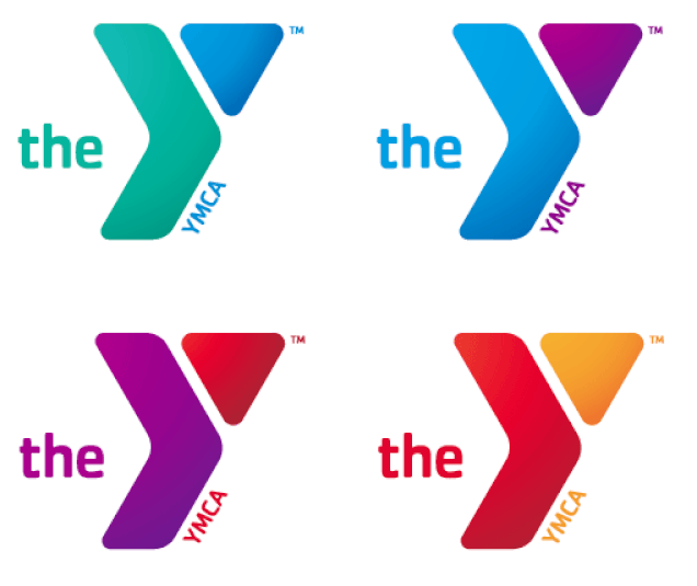
Few association logos have gotten more press than the 2010 roll-out of the new Young Men’s Christian Association (YMCA) logo by Siegel+Gale.
Rebranding more than 2,500 YMCAs across the country is akin to trying to give a pill to 2,500 cats simultaneously: it’s no small undertaking. They had to get it right.
As the official press release notes:
The Y’s former logo had been in place since 1967 and was the organization’s sixth since its inception. The refreshed logo, with its multiple color options and new, contemporary look, better reflects the vibrancy of the Y and the diversity of the communities it serves. The new logo’s bold, active and welcoming shape symbolizes the Y’s commitment to personal and social progress.
Having worked with several YMCA organizations, Mighty Citizen can speak to how appropriate this new logo is. It’s robust, lively, and well executed. The logo offers a lot of variety, with both gradient and flat versions in a plethora of colors. The updated mark features soft, rounded shapes that bring it into the 2000s (albeit a bit late). And the triangle harkens back to the 1967 version of the logo, carrying the legacy through to today.
My favorite part? The hidden right-pointing arrow that is a subtle reminder that the Y is committed to social progress.
How it makes me feel:
“The Y accepts me as the individual I am and helps me to become what I’ve always wanted to be, through my own personal progress.”
International Association of Drilling Contractors
I don’t search for drilling contractors everyday, but when I came across this association logo design, it got my attention.
This international association logo (by Philoveracity Design) is well proportioned. It’s simple on the surface, but it’s clear to this former designer that great care was taken in the visual execution of the logo. The two-tone drill is subtle and sophisticated, and all of the grooves (known as chisels) are perfectly in place. The IADC letterforms are well-spaced, and trust me, this isn’t always easy when I and A letterforms line up next to each other.
Being an international association, it’s clear the logo had to exist in multiple forms, from program logos to chapter logos, and still retain an overall consistent look and feel.
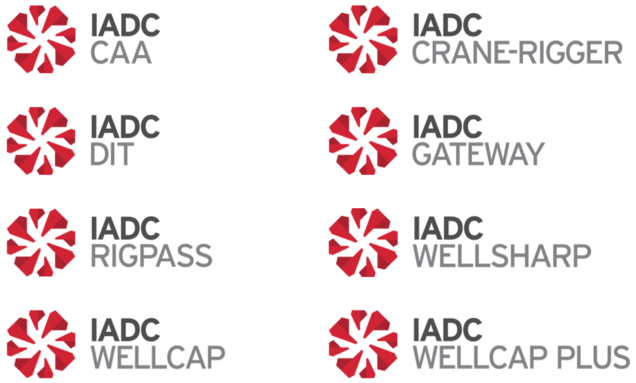
Above are the IADC Program logos.
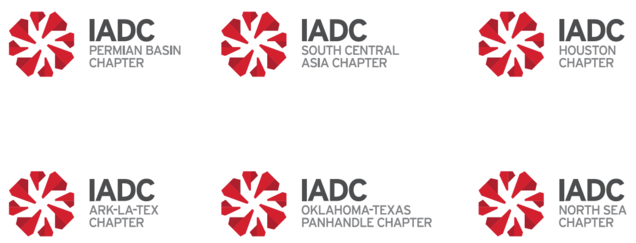
Above are the IADC Chapter logos.
The brand does a great job of carrying consistency across its worldwide association.
Association Logo Design Guidelines
The beauty and simplicity of the IADC logo is one thing. But what really elicits my love is their logo usage guidelines which can be found right on their website. These guidelines show the depth of consideration that went into the creation of the brand, and how it will move the organization into the future.
How it makes me feel:
“The IADC exists to help me be a better drilling contractor, and they have global programs and solutions to help me grow my business.”
So if you’re looking to move your association into the future, don’t forget one of the fundamentals that got you this far: your branding, and more specifically, your logo. An association’s logo should represent the core of the organization and set the tone for how it makes audiences feel.
A final note:
Notice there are no swooshes to be had in this list. Move beyond the swoosh!
