
Scary Website Mistakes Even Forbes 500 Companies Make
In the spirit of Halloween, we thought we’d share what really scares us: underwhelming website design. This plague can apparently strike anyone–even some of the country’s most behemoth companies have very poorly designed websites. Here are five of the scariest websites we found on the Forbes 500 and why they’re so dang frightening:
1. Berkshire Hathaway: The Word Document

If your website looks like a Word document, there is something very, very wrong. Berkshire Hathaway doesn’t seem to think so. For starters, it looks like no effort was put into this site. It’s extremely outdated, there are no images to engage users, and the homepage is a sea of links with no clear order. Even the logo looks like it was created in Word.
We get it, Warren Buffet doesn’t need to worry about SEO the way we smaller fish in the Google sea do, but we think it should be considered a public service to invest in website design with something of visual interest.
2. JP Morgan Chase: The Pusher

The JP Morgan Chase website has so much content on the homepage it’s truly headache-inducing. There are no clear sections or headers to help your brain categorize what’s happening here. While stories with images of people can draw you in, seeing too many at once can be confusing and distracting. It’s not clear how these stories are related to one another, if at all.
This site proves there is such a thing as too many stories, which will likely cause users to read none of them and run far, far away.
3. Delek US: Now Everyone’s a Photographer

The folks at Delek US must have forgotten the age-old saying “a picture is worth a thousand words.” Every photo on this site is blurry, dark, and horribly composed as if a random staff person (or stranger off the street) was hired as their in-house photographer using a cellphone.
When you click on any of the top menu buttons on this site, you encounter the same issue from Scary Site #1: You’re suddenly in a Word document. The lack of consistency across the site paired with the poor quality photos gives the impression that this was a low-budget, DIY design job.
4. Marathon Petroleum: The Eye Exam

Oh, Marathon Petroleum. If you’re going to have a ton of text on your site, even more reason to make the font legible. There are so many menu items listed on this homepage alone, even reading it on desktop is a challenge.
If you really want to test your eyesight, try looking at this site on mobile. They decided to keep the same homepage format and ignore the whole mobile optimization thing. The result: this desktop version zapped by a shrinking machine.
There’s no chance all the links on this homepage are getting used. The folks at Marathon should remove the dud links from every page of the site and let the header nav do its job.
5. ON Semiconductor: Something for Everyone

Holy cow, there’s a lot going on here. The ON Semiconductor homepage is shocking at first glance; the green text on a grey background is nearly impossible to read, and there are countless graphics and icons to decipher. If you dare dig deeper into the site, multiple other fonts, shades of green, and image styles await you:
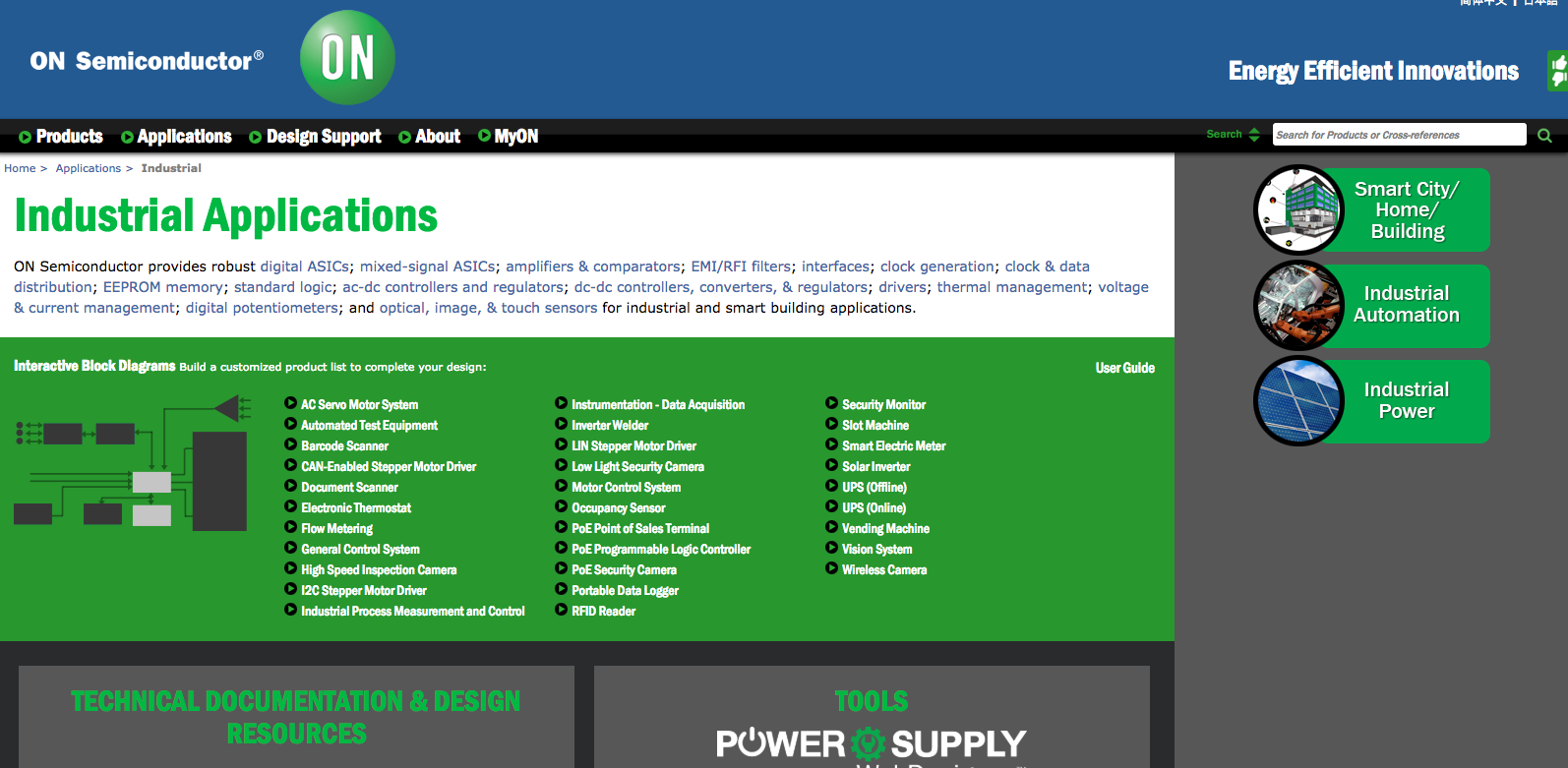
Something for everyone, or so they thought? It is critical to set clear brand guidelines that are conducive to easy readability—include guidelines for icons and graphics—and stick to them.
Thoughts on strategy delivered to your inbox.
Not to mention, none of these sites are fully accessible.
At Mighty Citizen, we are big on ensuring web accessibility. Over 48 million Americans use assistive technologies, so it’s beyond important to make sure your website works for everyone. Plus, it’s the law.
Some of the accessibility tools we use when re-designing websites for clients are Skipto.js, Alternative Text, Nested Headings, ARIA Labels, Foundation, Jaws, and WAVE Web Accessibility Tool. When we tested these Forbes 500 sites using WAVE, all five of them have errors. ON Semiconductors is the least accessible with a whopping 79 accessibility errors.
Without an engaging, accessible website, you’re bound to miss out on opportunities to attract new clients, donors, and funders. Even if you are a top dog on the Forbes 500. In fact, if you’re dealing with high-powered clients, it’s even more important to convey credibility through sharp, user-friendly design. Make sure your website is effective, well aligned with your mission, and shows your clients why you’re best in class.
If you know your website is giving people the heebie jeebies, it’s time to recommit to your greatest asset. And if you’re not sure whether users think your site is tricky or a treat, take some time to self-assess using our Website Evaluation Kit. Let’s save the spooks for the streets, friends.
Happy Halloween!