
Five Ways to Make Your Website More Donor-Friendly
Imagine two nonprofits that are nearly identical. Similar missions, same size, equal marketing budgets. They both have websites that do an admirable job of showcasing their impact.
In most obvious ways, these two organizations are twins.
But one of them raises much more money online than the other. Why?
Online Giving is Worth Your Attention
Last year, only 7.6% of all charitable donations were made online—a 12% increase over the previous year. (Source: Blackbaud)
So, while online giving remains surprisingly meager, it’s (unsurprisingly) trending upward at a healthy clip. (And with digital natives—aka, Gen Z—beginning to leave college and enter the workforce, online giving isn’t going to plateau anytime soon.)
Nonprofits have websites in order to fundraise. Sure, websites serve plenty of other needs—e.g., register volunteers, share impact, announce events, etc.—but these are distant runners-up to the primary purpose: increasing donations.
So how do we ensure that our online experience is designed for donors (both current and would-be)? And how can a website make charitable giving a given?
How to Make Your Website More Donor-Friendly
1. Make the Homepage a Hero
When a visitor lands on your webpage, they’re often there to do one of two things:
- Make a donation
- Decide whether to make a donation
The first audience—i.e., the people who already know they’re going to give—need little more than a big shiny “Donate Now” button. More on that in a minute.
But the second group? You have to give them a reason to care.
Before your donors are willing to dig into their pockets to help you, you have to move them. Simply asking will only get you so far.
There is no action without emotion. So your website should, quickly and compactly, trigger emotions. The quickest way to inspire emotion—fear, anger, happiness, etc.—is to lead with your mission. And the quickest way to do that is to ensure you have a snappy “hero message” on your homepage.
The Boy Scouts of America offer a stellar example with this hero message:
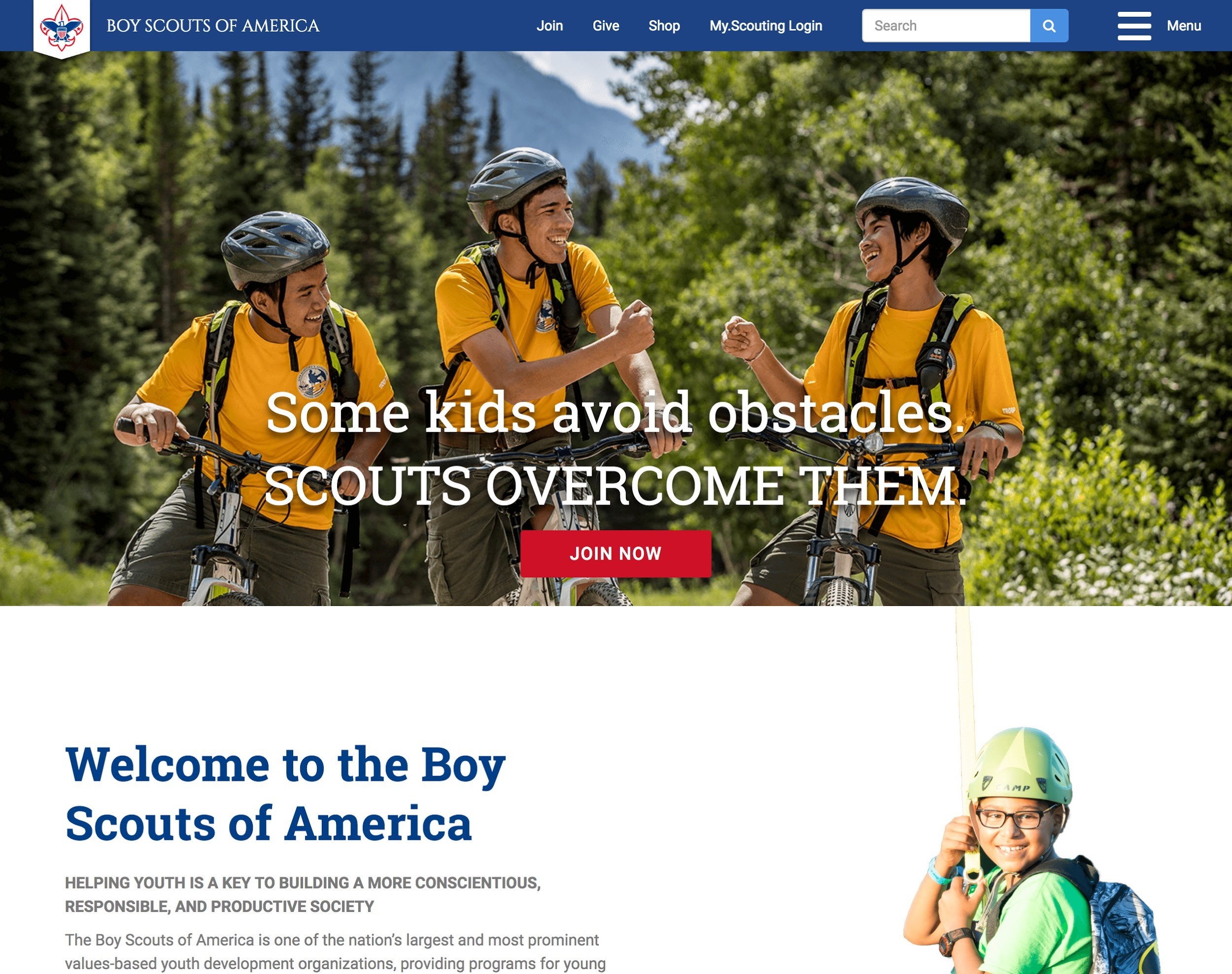
Some kids avoid obstacles. Scouts overcome them.
Why is this hero message great? A couple of reasons:
- It’s rhythmic, almost musical.
- The message plays on a common ambition: being exceptional, standing out, vanquishing the ordinary. Some kids are fearful; Scouts aren’t. You want to be special, don’t you? You want your kids to separate themselves from the pack, right?
And the photo that accompanies it—big, bright, full of smiles and nature and friends—bolsters the message. These are Scouts, not ordinary kids. The message is clear, instantaneously, to anyone who lands on the homepage.
2. Simplify
Next, it’s time to audit your donation process.
Is it simple? It should be. Simplicity is key. Research proves, time and again, that a confusing or technically complex donation process will cost you money. Users who decide to give but then encounter a hiccup are more likely to get frustrated and leave.
We often think of donors as making donations the same way they pay their monthly bills: it’s an errand, a chore that they dutifully complete.
But for many donors, the donation process is a moment of spontaneous generosity. They’re in a momentary “state of charity.”
So when these would-be donors see a long, field-heavy donation form, they may grow fatigued and slip out of their generous mindset. And voila, they’re gone.
So we recommend you make your donation process:
As Short as Feasible
Don’t ask for more info than you need. If you don’t need to know their salutation—e.g., Mr. or Mrs. or Miss—don’t ask for it. If you never plan to call them, don’t ask for their phone number. The more questions you ask, the more likely it becomes that your users will suffer from “cognitive overload” and decide it isn’t worth the trouble.
Multi-Step
You may also consider a multi-step donation form. A multi-step donation process means having multiple pages: one for the donor’s basic contact info, another step for their payment info, another step for donation amount and type, etc. This approach offers a few advantages:
- It mitigates the risk of user fatigue. Instead of seeing one long, exhausting form, the user is asked only a small handful of questions at each phase.
- It allows you to use Google Analytics to see where, exactly, in the donation process your users drop off. If only 50% of users who complete Step 1 also complete Step 2, you know where to make a fix.
3. Each Page Has a Goal
Beyond the homepage and donation page, each page on your website also needs a purpose. Far too often, organizations add a page to their website without having a clear, compact reason for the page. “Because we want one” isn’t adequate reason to add a page. Instead, for each page you propose adding, write down the following about it:
- Page Title: What is the title of the page?
- Content Owner: Who is responsible for the content of the page?
- Section of Site: What section of the site will it appear it?
- Purpose: What is the main goal of the page?
- Audience: Who is the page meant to speak to?
- Desired User Action: What specific action do you want a page viewer to take?
If you can identify all of these elements of a page—and you still want it—then you’re ready to create and publish it. The most critical parts are “Purpose” and “Desired User Action.” The purpose of a webpage should be singular. Each page does one thing—no more, no less. Once you begin overloading a page with different topics and/or targeting different types of audiences, you risk confusing and misleading your users.
Meanwhile, on every page, you should know what you want your user to do next. This is a concrete action—e.g., click on this link, navigate to a sub-page, download a document, fill out a form, etc. Sometimes, identifying the desired action first helps you understand the purpose of the page and craft your content to drive the user toward the desired action.
Note: You want your users doing things online. Therefore, ambiguous and passive user activities won’t suffice. For example, your page’s purpose shouldn’t be “learn about our programs” or “understand our mission.” You want them clicking, downloading, etc.
Insights on donors delivered to your inbox.
4. Test, Test, Test
Don’t assume your website is working perfectly. Instead, test it. Then test it some more. And when you change something on your site, test it again.
Remember, you think about your organization infinitely more often than your users do. This is called the “Curse of Knowledge”—i.e., once you know something, it’s impossible not to know it. The Curse of Knowledge describes the big challenge facing fundraisers and marketers: getting people who don’t know what you know to know it.
And the Curse of Knowledge explains why so few organizations bother testing their digital content. It makes sense to them; surely it will make sense to the uninitiated website user. But this is rarely the case. They simply don’t have the context, experience, or knowledge you do.
So how do you test your website’s usability and UX quality? For starters, download this free Website Evaluation Kit. It allows you, on both a website and individual webpage scale, to evaluate the effectiveness of your content. Is it accurate, on brand, accessible to all users, etc.?
Then you can conduct some simple usability testing on your own. Gather a few people who have never used your website. Sit down with them and ask them to conduct simple tasks on your site—e.g., “Find our event calendar” or “Make a donation.”
Then simply watch them do it. Record your notes:
- Do they mis-click?
- Do they get lost?
- How quickly do they complete the task?
- Do they get side-tracked or distracted along the way?
You can learn more about your website’s shortcomings in 10 minutes of watching someone use it than you could in hours of internal brainstorming meetings.
5. Put Accessibility Front and Center
In web design, “accessibility” refers to whether online content can be used by everyone regardless of their ability or disability.
With more than 60 million Americans who have some form of disability—many of whom use assistive technologies like screen readers and screen magnifiers to browse the web—making sure your website is fully accessible isn’t just the right thing to do, it’s smart business. After all, if someone with a disability can’t perceive, understand, and interact with your website easily, they won’t become donors and supporters.
So how accessible is your website?
Fortunately, there are website accessibility testing tools online that will show you how accessible your site is—along with where, exactly, you’re coming up short.
One of my accessibility testing favorites is the WebAim Website Accessibility Check (but there are plenty of others).
But this site tells you what’s already troublesome on your site. How do you make sure future content—text, images, videos, interactions, etc.—are accessible in the first place?
For that, read this free How-To Guide: Website Accessibility. It will explain, step by step, why accessibility is such an important use of your time and how to ensure you’re adhering to accessible design standards. There are simple, quick things you can do today to make sure you’re not alienating millions of potential users.
Summing It Up
There’s a ton that goes into streamlining your website’s effectiveness. But the low-hanging fruits—a clear hero message and a simplified donation process—are still woefully under addressed by many nonprofits. Make sure yours isn’t missing this easy opportunities to boost your donations.
This article was originally published on NPEngage.