
Get More From Your Thank You Page
These words are spoken by Sebastian to his friend Antonio, who’s been helping Sebastian since their ship wrecked on the shores of Illyria. Antonio replies that he enjoys helping Sebastian because they’re friends.
Shakespeare understood in the 16th century what psychologist Abraham Maslow articulated 400 years later in his famous Hierarchy of Needs: Humans crave gratitude—both giving and receiving. Thanking is integral to human connection, and that’s all anybody wants, right? Heck, we have a national holiday designed specifically for the simple and profound act of acknowledging each other and our shared good fortune.
But if thanking is such a powerful force, why aren’t thank you webpages better? What can you do to make sure you’re getting the most from your site’s thank you page?
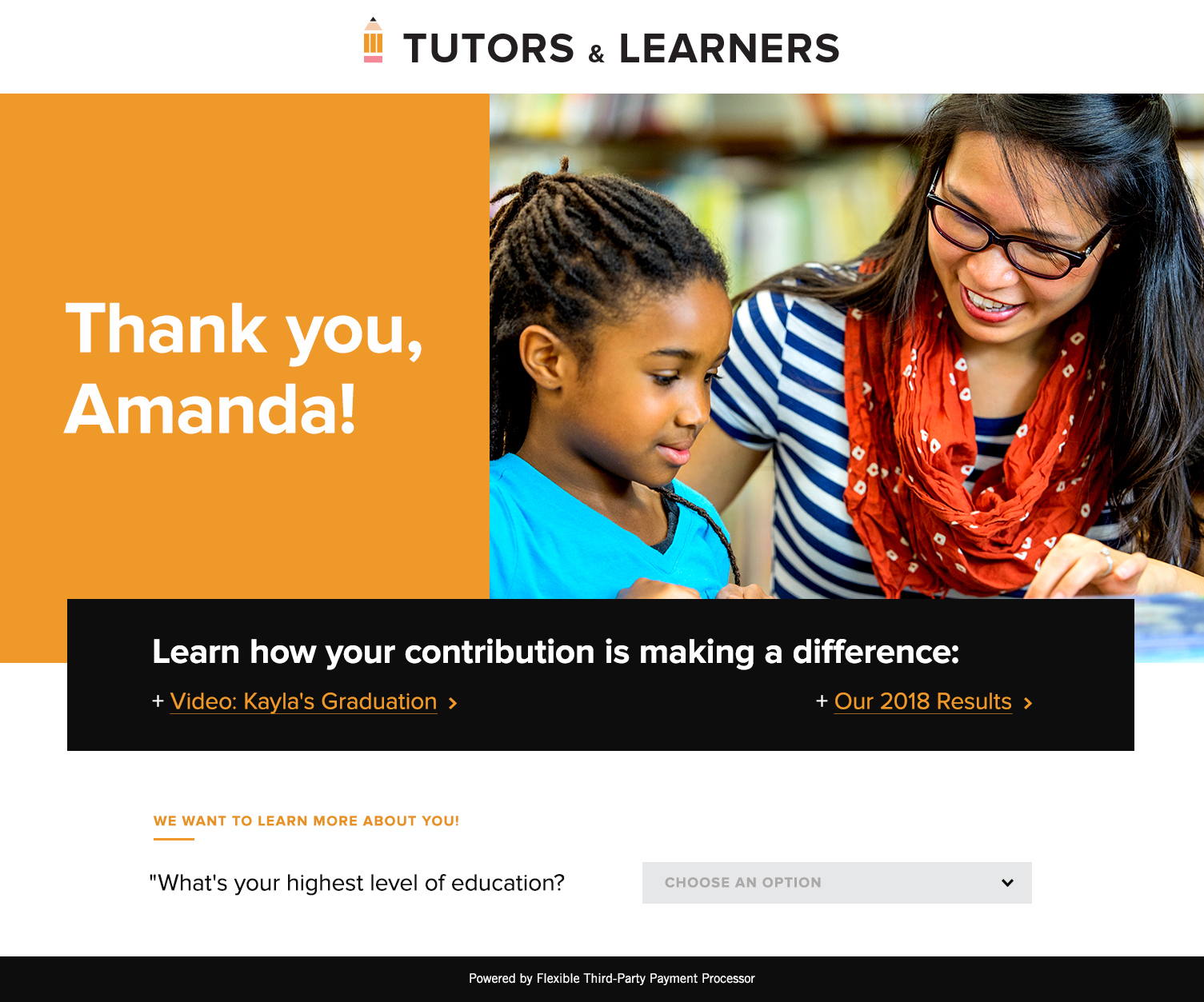
Here’s a good thank you page we created. It’s for a fake nonprofit’s donation process:
Here are five things we think you should include in your thank you page—whether it’s for a donation, a membership sign-up, a webinar reservation, etc.
1. Say “Thank you!”
You might be shocked to discover how many organizations forget the “thank you” part of the thank you page.
Say it. Say “thank you.” Make the font big and colorful. If your thank you page does nothing else—and it should do more (see below)—make sure it says “Thank you.”
No need to gild the lily with fancy variations on “thanks.” You don’t need:
- “You rock!”
- “Heck yeah!”
- “Payment confirmed.”
By the way, “Thank you” doubles as a confirmation, for the user, that the transaction was successful.
2. Send Them Somewhere Else
The seconds after they click “Submit” are the most positive your users will feel about your brand. They just committed to interacting with you. Seize that fierce blip of happiness! Leverage it to move your users deeper into your brand.
Thoughts on strategy delivered to your inbox.
But where, on your website, should you send them? Which links should you place on your thank you page?
Of course, it depends. But some things we know for sure:
First, don’t overdo it with links. The wider the choice, the more paralysis users might feel. “Where do I go? I don’t want to read through this laundry list of items.”
Second, send them to your finest content. Do you have a fantastically designed and written page somewhere? Link to it. Do you have pages that are lacking pizazz and which Google Analytics suggests aren’t very popular? Don’t link to those pages, even if they’re pages you deem “important.” (And get to work improving that lackluster content!)
Third, personalize the content. This requires some semi-fancy web development. But just imagine if, when someone donates to your after-school program, the thank you page contains (a) the message “Thank you for donating to the kids,” (b) A slick video of the kids talking about how much they love the program, and (c) links to the latest after-school program newsletter. That is an experience that will delight your users.
Or, at a minimum, you can use the new donor’s name in the message. (In this case, “Amanda.”)
3. A Great Video or Picture
A video is better than a picture. A picture is better than nothing. “Nothing” is unacceptable. If your thank you page contains only text, you’re ignoring—even offending—your younger audiences, who communicate visually. (By the end of 2018, about 84% of communication online will be primarily visual. Source.)
But what constitutes a “great” video or image?
Authenticity.
Yes, yes, yes, this is an overworked buzzword, I know. But as Millennials and Gen Z’ers become the largest economic forces in the world, organizations have to revisit the notion of “authenticity” because these two generations can spot fake from a mile away. And they hate it.
The marketing experts will say that you don’t need a big photography/video budget. But a shaky, dimly lit iPhone picture or video won’t suffice, either. Another thing about your younger audiences: Great design has been a part of their entire lives. They don’t just want a seamless, smart-looking digital experience, they expect it. If you deliver an image that looks “outdated” or “traditional,” you run the risk of seeming outdated or traditional—two adjectives with which your brand doesn’t want to be associated for these audiences.
Oh, and make sure your thank-you pic/video has people in it. Images of things or places are far less noticed than pictures of human beings.
4. Your Logo and Tagline
Seems super obvious, but we have to say it. Many organizations use a third-party payment/sign-up tools. And many of these tools have (severe) restrictions on how you can “brand” the thank you page. (Even worse: Because the thank you page exists on this third-party platform, your Google Analytics insights are basically nonexistent.)
Either process donations/sign-ups directly on your website or choose a tool that gives you plenty of freedom to brand the thank you page.
Here’s why this is so important: Consistency.
Nothing—nothing—irritates, confuses, and repels users more than a lack of consistency online. If they’re shown something (e.g., a thank you page) that suddenly feels incongruous and different, they’ll associate their irritation and confusion with your brand. And of course, that’s a big fail you want to avoid.
If your thank you page is limited to some basic text, a poorly-sized version of your logo, and a page layout that doesn’t align with your website, you need to switch to a new third-party processor.
5. Ask One Question
Because your newly minted donor/member is feeling so positive, now’s a great time to ask something. Remember, we want our donation/sign-up form to be as simple as possible, so we don’t want to add unnecessary questions. But on the thank you page, it suddenly becomes OK to ask.
Which question should you ask? A question whose answer will help you behave differently.
Too often, organizations ask questions not because they’re going to turn them into action, but simply because other organizations ask them. It’s tradition. Eschew tradition, and pick questions that will produce answers that you can do something with.
For example, if you’d like to craft two separate marketing campaigns—one for Gen Z and one for everyone else—ask your users their age on the thank you page. Or perhaps you want to know which marketing channels are offering the best ROI, ask, “How did you first learn of our organization?”
But before you ask anything, make sure you’re poised to take advantage of the answers you get.
The Final Word
Thank you pages shouldn’t be afterthoughts. They should receive the same intention, design, and attention as any other page on your website—including your primary call to action. Users expect organizations to communicate with them authentically, and if you don’t offer an authentic “thank you,” you run a higher risk of losing them.

