Donation Forms Dissected: Where We’re Winning & Losing in Online Fundraising
We’ve filled out a lot of online donation forms. We constantly make small donations to some of our favorite causes to see exactly how well their donation forms perform. With online giving (including mobile giving) on the rise, we’re always hunting for shining examples of the very best donation experiences.
To see how the average online giving experience is faring, we recently did a little experiment. We donated to 10 organizations of all different sizes and tracked the following:
- Did they make it clear why I should donate?
- How many clicks did it take me to give?
- Was the donation form a scrolling or multipage experience?
- How did the donation form look and function on mobile?
- Was monthly giving an option? Was this option highlighted or auto-selected?
- Were there suggested donation amounts?
- Did they nudge me to donate more?
- Were there any segmentation questions?
- Was contact information for the organization made readily available?
- Was the thank you page well designed and celebratory? Did it promote more ways to get involved?
Based on these 10 organizations and the much larger sample size we’ve seen this year, here’s where the nonprofit sector is winning and losing in online fundraising.
Where We’re Winning in Online Giving
Making Mobile Happen
Of the 10 organizations in our mini giving experiment, eight and a half made it possible to donate on mobile. The half is in reference to a disease prevention association that shall not be named; their donation option worked on mobile but was so difficult to find and so rigorous to complete, we highly doubt users ever stick with it.
While we should absolutely be at 10/10 on this one, the sector has come a long way in the last few years. Now it’s time for organizations to enhance the design of their mobile donation pages and forms.
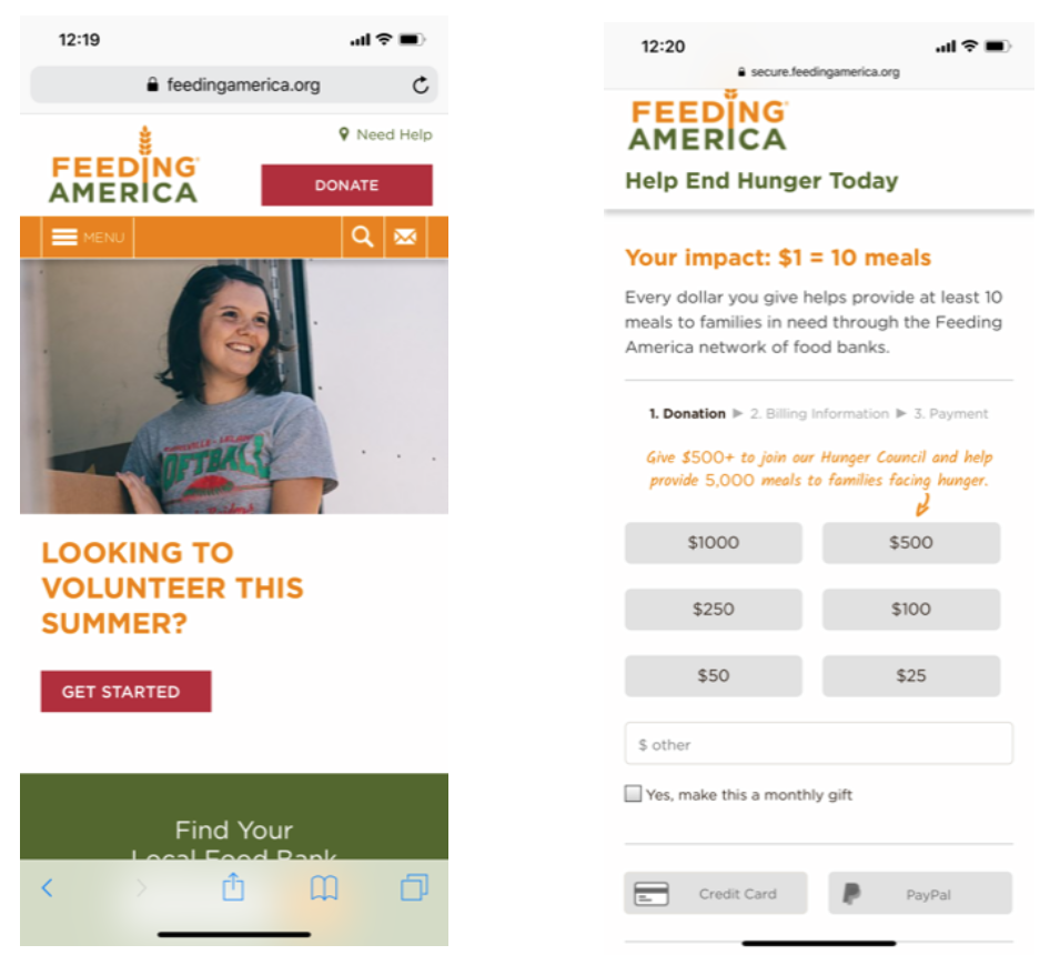
Our favorite mobile giving experiences are simple. If they have a multi-page form, there’s a progress bar to let users know what they’re in for. Big buttons, white space, and colored text keep Feeding America’s mobile donation form feeling fresh and clean. And that red DONATE button is the north star on every page of their mobile site:

Source: Feeding America
Sharing Our Whys
This one’s exciting. 10/10 organizations in our little test made it clear why they exist on their websites. Thank you for your service, Simon Sinek. This tells us that more organizations are investing in meaningful messaging that inspires donors.
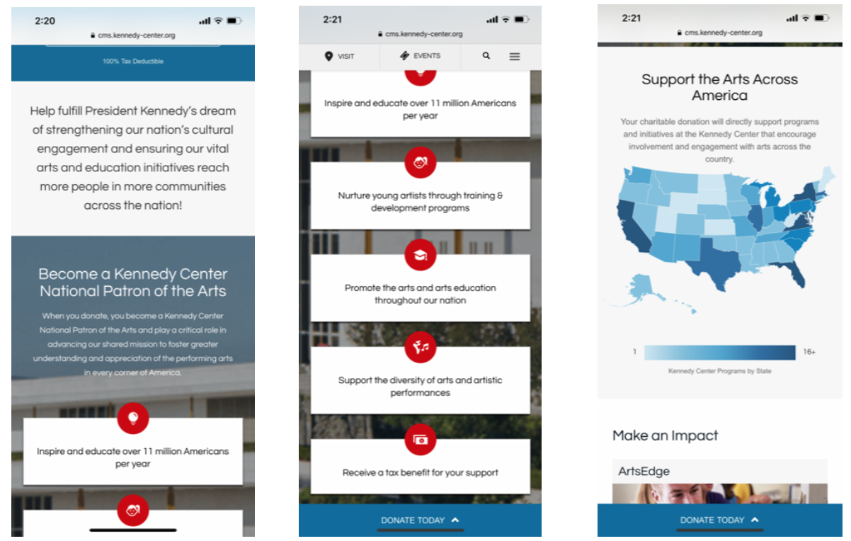
The Kennedy Center has done a nice job of conveying their why in a variety of formats that display well on mobile:

Source: The Kennedy Center
Offering Recurring Giving
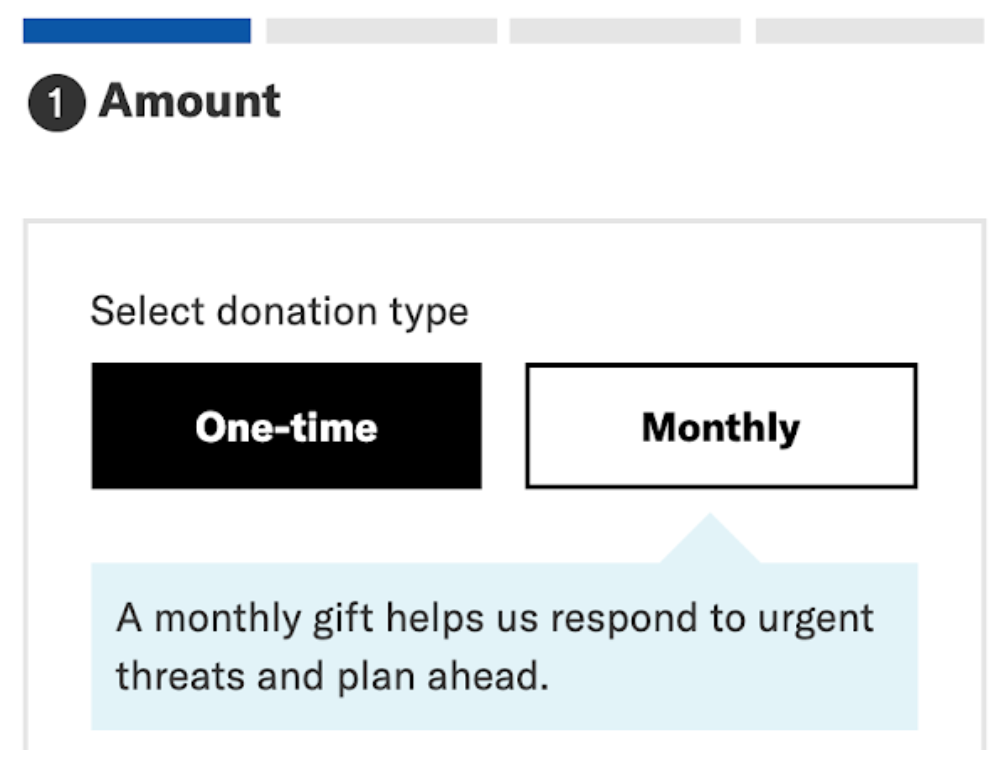
The keyword is “offering” here because while seven of the 10 organizations we reviewed have an option to give on a monthly basis, only a few are really highlighting this option. We like how ACLU calls out their monthly option, creating a sense of urgency:

Source: ACLU
This year, it’s critical that every nonprofit has a recurring giving program that’s a true program, not just an option on their donation form.
Consider this—monthly subscriptions are now a staple in our everyday lives. Just look at streaming services like Netflix and Spotify, news subscriptions, and curated product boxes. What motivates people to pay monthly for these products and services? How can you provide a valuable, delightful experience that’s also worthy of a monthly payment?
Suggesting Donation Amounts
Everybody nailed this one! The most common suggested donation amounts we’ve seen are $25, $50, $100, $250, $500, and $1,000. We like this range because it anchors people at a higher donation amount. We even encourage most organizations to test higher amounts!
Most organizations are missing out, though, by listing their suggested donation amounts from smallest to largest. Your suggested donation amounts should always start with the highest number so your range looks something like this:
$1,000, $500, $250, $100, $50, $25
In our experience, when presented with multiple options, and with the highest options presented first, users will typically opt for the middle-ground choice. If your highest suggested donation amount is $50, don’t expect anyone to manually donate $500. But if your first suggested amount is $1,000 or $5,000, you’re telling users that people commonly donate these amounts, anchoring them to give more.
Where We’re Losing—Which Means Losing Money
Requiring Account Creation
Lots of organizations require a (lengthy) account creation process in order to donate. Don’t do it! You can capture enough rich information about new donors without forcing them to create a login before giving their gift. We’re all inundated with logins and passwords; the mere act of creating another one can quickly turn would-be donors away.
Ask yourself: Do we absolutely need every field that’s in our donation form? If you’re requiring things like title, multiple phone numbers, or even a Street Address 3 (which I came across recently), then you’ve definitely got trimming to do.
Turn your inbox into a toolbox.
Not Enough Nudging
Firstly, most organizations aren’t doing enough on their websites to nudge people to donate. One red button in your top navigation is an important starting point, but it’s not enough. You should have stories and callouts all over your website encouraging people to give!
Then, most organizations’ donation forms don’t nudge people to give monthly or to give more. Your potential donor has made it to your donation form! So how can we spur them to go big?
Encouraging these actions is both an art and a science. There are UX basics that we know work. And beyond these, A/B testing different options will uncover the nudges that work best for your users.
For a great example of this, let’s revisit Feeding America’s donation page. Did you notice that they include language that reads, “Give $500 to join our Hunger Council and help provide 5,000 meals to families facing hunger?” Now, that’s a nudge.
Frail Thank You Pages
Of the 10 donation forms we tested, we weren’t thrilled with any of their thank you pages. This one really hurts our hearts, because it’s such an important opportunity that most organizations are still neglecting.
Reaching your thank you page should be the happiest, proudest moment of a user’s entire experience on your website. This page should be bright and beautiful. They just made an impact and they should be rewarded!
You just captured your new donor’s information, so thank them personally. You should remind them of their impact and invite them to participate in other actions on your website. Take a look at this example thank you page we put together to illustrate how a great thank you page might look:

Lacking Segmentation Questions
For organizations that are collecting segmentation data about their donors, many tend to do it in the donation form. This leads to increased donation form abandonment. As we mentioned above, you want to keep your forms as simple as possible and cut any non-crucial fields.
Instead of asking a ton of questions when someone is trying to donate, ask segmentation questions directly afterward to learn more about them. Right after someone donates—either on your thank you page, via email, or both—you should ask questions that will directly inform your segmentation strategy.
You might ask them which kinds of content they’re interested in receiving from you, or which of your issue areas is most important to them. You might ask if they’re interested in learning more about volunteering or peer-to-peer fundraising. The key here is that whatever you ask, you’ve got to be ready to use the information you collect to better serve that donor.
So, How Do You Measure Up?
Nowadays, there’s simply no excuse for a hidden, ugly, burdensome, or malfunctioning online donation experience. And there are easy changes you can make to make more money!
We hope you’ll check your own donation experience against these criteria and make an action plan to take it to the next level. The good news for you is, with so many organizations missing the mark, a beautiful and seamless donation experience will automatically set you apart.
Once you’ve made changes to your online donation experience, download our free fundraising campaign metrics template to track the impact of your improvements!


